Brands
Build a Gorgeous Blog without a Design Degree
A great blog communicates on all levels, including visual, to attract and retain an audience. Even if you’re not “artistic” and lack the budget for a custom design, you can still have an attractive blog.
1. Know the Common Building Blocks
Learn the basic design elements. You might not use them all (perhaps you don’t run ads, for example). But you need a header that says who you are, an area for your content, navigation, headlines for each post, a place for reader comments, social network and subscription links, a footer (the bottom-most area) for each post, and a site footer.
Also consider smart design from other publishing areas, like the magazine deck — the single sentence below the headline that both summarizes and sells an article’s content. It helps draw people in and works better than running each first sentence in a list of posts.
2. Plan It Out
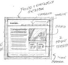
Designers start with a plan. Create a list of what needs to appear on your blog. Do you plan separate sections for original and curated content? Will there be a blog roll? A feed from your Twitter account? Next, take pencil and paper and do a rough sketch of what the blog should look like in the browser.
Don’t worry about your drawing ability. Just block out the major areas you need and label them. One-column, two-column, and three-column layouts offer trade-offs — additional columns give more options of where to put elements of the blog, but can look more cluttered. Try different arrangements and see what seems most appealing while making changes only means using an eraser.
3. Find Inspiration
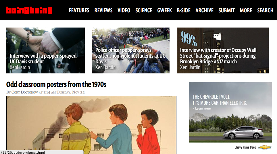
Look at successful blogs, such as Problogger, Copyblogger, boingboing, or Gawker. Find blogs you admire that address a similar audience as yours. Consider why the site works visually, doing a block diagram as part of the analysis.
What appeals to you? Compare these layouts to the ones you previously sketched. What changes could improve them? Why do you like one header over another? Maybe it conveys an image of calm or, contrarily, excitement. You might respond to the color scheme or a powerful image. What does the use of fonts say to you? Modern? Solid and rooted in tradition? Eccentric? View the page source. See how large images are set and what typefaces the designer used.
Don’t simply copy the site. Success comes from finding your own voice and look. Remember the famous saying: Good artists copy; great artists steal.’
4. Learn the Code
This step may take time, but the investment will be worthwhile. It’s easy to use a preexisting template or theme in a blog, but what you get isn’t unique … isn’t you. To adapt something already existing or to create your own using examples you can find means you’ll need to write some code.

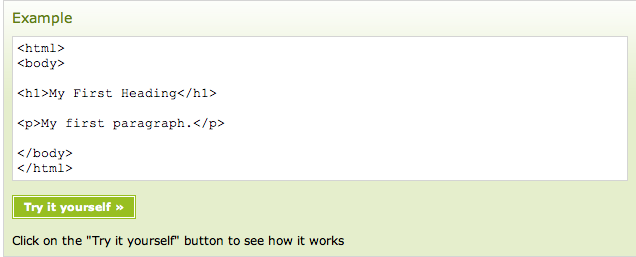
Simple tutorials like the ones at W3 schools can help you visualize your code, and help you fix your mistakes
You should start with learning some HTML, the basic language of the web. There are free online tutorials like this one. Next, you’ll want to go through atutorial on CSS, which stands for “cascading style sheets.” That will become the critical design layer for your blog.
You’ll also need to learn how code for your particular blogging system goes together. WordPress offers its codex, which is the online manual. The lessons section has tutorials for developers. There are many other online resources as well, including this guide to modifying WordPress themes. Very handy.
Similarly, there is extensive documentation on Movable Type and Google has information on customizing Blogger.
5. Time to Implement
You know what you want your blog to look like. Now you’re ready to actually put everything together.
Start with an existing theme or template that’s as close to your idea as you can find. Match the number of columns, basic layout, and typography if possible. This puts the essential code into place. Save a backup copy and then edit your working version. Find the images you want for the header. Change colors of everything to what suits you. Shift the column widths and header height. Swap out widgets. Soon enough, you’ll have made the design your own.
Yes, it’s a fair amount of work. But you’ll save money and be proud to know that your blog is really yours.
Related articles
- The Best Tools on WordPress to make your Content Look Great (contently.com)
- 25 Must-Haves for a Remarkable Website (hubspot.com)
- How Big Should Your Blog Be? An Informal Formula (contently.com)
- 10 Tools For Converting Your Blog’s New Visitors Into Fans (contently.com)
Get better at your job right now.
Read our monthly newsletter to master content marketing. It’s made for marketers, creators, and everyone in between.


