Marketing to customers via email can be an uphill battle. Companies have to battle spam filters, ISP regulations, and low engagement rates just to get their messages across.
 But with a little creativity and imagination, marketers can captivate subscribers and convince them not to click the dreaded unsubscribe link.
Email marketing shouldn’t just contain text. It’s been proven over and over again that on the internet, images stand out to readers more than text does. This is true in emails, on blogs, and alongside updates on social media sites. There is no question — images work when it comes to getting the reader interested.
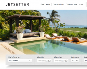
Jetsetter, a travel promoter, is a good example of a company that takes advantage of the pictorial opportunities in its industry. It sends out beautiful photos of destination locations to subscribers in its newsletters, writes HubSpot Blog‘s Corey Eridon.
“When you have breathtaking photography like you see in their emails, why would you lean on copywriting to tell your story?” Eridon writes. “A very simple photographic lineup of the vacation destinations being featured is all that’s needed to get email click-throughs and site conversions.”
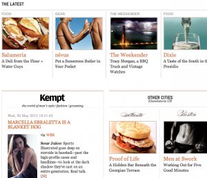
 Eridon also points to UrbanDaddy, an upscale online magazine, as a company that does email marketing right. Its email headers always contain graphically glamorous shots, getting the reader interested from the get-go.
Drawing from its site layout, Pinterest makes the cut for producing brilliant newsletters, says Eridon. Since the site itself is already visually appealing, the company decided to make the newsletter almost identical.
What all these companies have in common is that they put out clean, slick looking newsletters, full of imagery that compels the reader to stay subscribed. When 77 percent of American consumers don’t want to give out their emails, marketers have to work hard to keep them satisfied.
Image by
Flickr