Brands
3 Excellent Blog Makeovers to Learn From
A 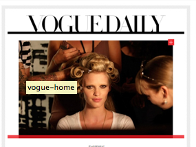 company blog is a constant work in progress. With more digital editorial content available, periodically updating your blog’s look is necessary in order to get attention.
A good site redesign follows business objectives while creating an aesthetically pleasing experience for readers. The best site redesigns challenge the status quo in editorial while considering the needs of the readers, and how they discover and consume information. Gawker, Mashable, and Vogue all had site redesigns that made an impact on their business and showcased their innovation.
1. Gawker Redesign – February 2011
Objective: Increase Page Views
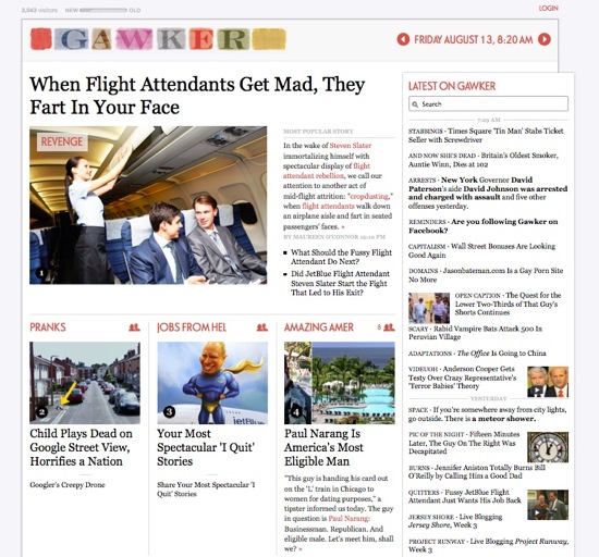
Gossip blog Gawker redesigned its site earlier this year to encourage more click-throughs, leading to more page views and eventually more advertising dollars. Founder Nick Denton observed how sites like TMZ were known for getting the latest scoop and wanted to create the same phenomenon for Gawker. However, while the traditional reverse-chronological blog format showed the latest story, it did not allow for the best story of the day to be featured.
The current design allows feature stories to have real estate via a splash story template instead of being pushed down by more recent stories. When a person links to the post, they receive not just a single story but a supplementary index of other recent items. Since the web is becoming a more visual medium, each story now has a large visual such as a video or photo to accompany it.
2. Mashable Redesign – December 2010
Objective: Focus on Content
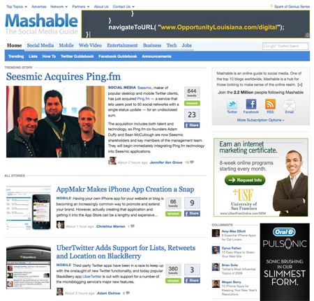
When you are a leading editorial publisher with audiences worldwide, your best product is your content and the columnists who write it. Mashable’s previous design was cluttered and difficult to navigate through. The current design features an adjusted header with navigation to specific topics, organizes content into categories, and brings attention to a trending story before showing the most recent. Offering more categories expanded the blog’s audience and better targeted current readers.
Columnists are highlighted via a new sidebar feature with recent stories they have written. For each post, the author’s image is posted below the preview along with a time stamp of how recently the article was written. The design includes more white space, providing a cleaner reader-friendly design. Mashable could not call itself the leading social and tech blog if sharing wasn’t encouraged. Readers can log in and “share through Mashable” or through any of their preferred social networks.
3. Vogue Redesign – September 2010
Objective: Bring Brand Values to Digital Realm
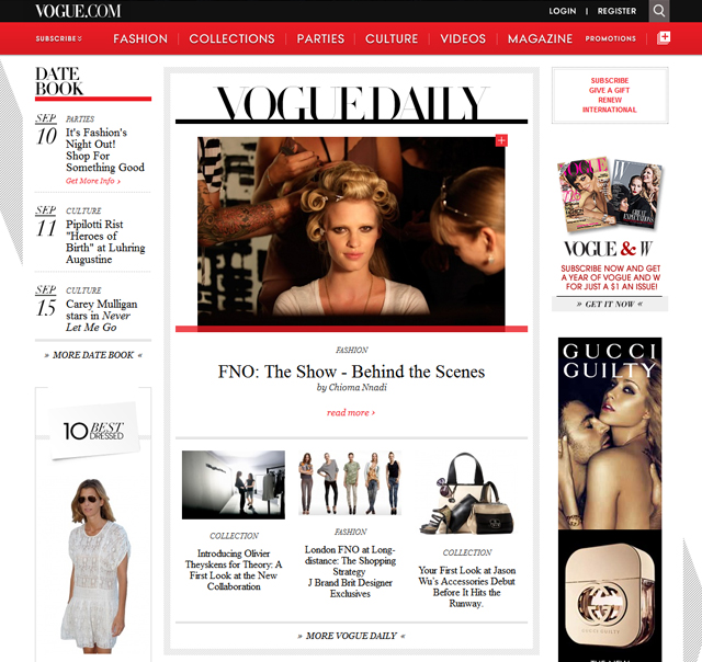
In 2010, Vogue found itself with an audience that was becoming more engaged in digital. Vogue catered to that audience and revamped its website to show its authority on fashion and its focus on style online. Since Vogue’s print magazine is known for its impeccable aesthetic appeal, the same had to apply to its site. The colors and typefaces are dramatic, images are huge and social sharing is encouraged along with opportunities to interact with the content. An interesting feature are “lightboxes” which readers utilize as their own bookmarking tool or lookbook, making the browsing experience more interactive.
The magazine or “editorial” layout lends itself very well to a site that is essentially a digital version of Vogue magazine itself. The site offers a multimedia experience with full-screen slideshows and videos. There is currently a full-screen slideshow featuring the Vogue Archives with 125 years’ worth of covers readers can browse through. Vogue’s site design enhances the overall editorial experience, where both site and print publication can support one another.
Every time a new website design is introduced, there is always reader backlash since it momentarily disrupts their browsing routine. With innovation comes resistance, since people enjoy what’s familiar. However, companies like Gawker Media, Conde Nast (which owns Vogue), and Mashable are known for challenging the status quo, which has been key to keeping their blogs at the forefront of digital media.
Related articles
- Build a Gorgeous Blog without a Design Degree (contently.com)
- 7 Factors to Consider When Redesigning Your Website (mashable.com)
- How To Make Your Blog Posts As Shareable As Mashable’s (contently.com)
- 10 Tools For Converting Your Blog’s New Visitors Into Fans (contently.com)
Get better at your job right now.
Read our monthly newsletter to master content marketing. It’s made for marketers, creators, and everyone in between.
