Content Marketing
5 Free Data Visualization Sources for Bloggers
People process data visualizations much better than text. They’re also more likely to share them.
We’ve compiled a quick list of free visualization sources for bloggers so your readers can better understand your data, and maybe even make it go viral.

Many Eyes
Many Eyes is an IBM-backed visualization powerhouse. It’s been around since 2005 and often looks it. Mildly dated appearance aside, it’s a time-tested, simple and comprehensive data visualization resource.
Indeed, Many Eyes runs the gamut of data visualizations, from maps to tree maps to word trees, and features thousands of user-uploaded data sets (obviously, always be skeptical of the data source and methodology).
What’s best about Many Eyes though is its learning-centric feel, such as its series of “when to use” explanations for different visualizations—so visualizers don’t end up with line graphs where their bar charts ought to be.
Many Eyes accepts simple data formats as well as pasted information to create live, embeddable visualizations.
Visual.ly

Full discloser: I’m a researcher and blogger for Visual.ly. I’ve included Visual.ly because I think its offerings are of particular merit these days as social media eats up larger sections of our lives and of the online conversation.

Using the Facebook and Twitter APIs, Visual.ly allows users to visualize social media. For example, users can explore demographics and engagement of certain Facebook pages or watch Twitter topics and handles battle it out for popularity—all in handsome, pre-established formats that make data visualization even more fun.
High Charts JS

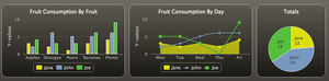
Highcharts is a free Java Script data visualization resource for non-commercial users (non-profit organizations, students, universities, public schools and non-commercial personal websites).
If you fit that bill, Highcharts offers numerous attractive visualization options for combinable, interactive and editable graphs. The finished product is live, embeddable and downloadable in multiple formats—it also looks really good.
Google Fusion Tables
Google Fusion Tables is part of the Google Documents (now Drive) suite that lets users create documents, presentations, visualizations in the cloud—without worrying about software or location.
 To begin with Google Fusion Tables, go to Google Documents/Drive and go to “Create > More > Table (beta).” From there you can upload a spreadsheet, create your own in Google Docs or insert data into an empty table to make a number of basic visualizations that are live, embeddable and sharp-looking.
What’s best about Fusion Tables is how intuitive it is. For example, If your data set offers a column with locations, Fusion Tables will automatically highlight that column and give you the option of mapping it.
Google Code Playground

 For our purposes, the visualization option lets users create a number of visualizations—from motion charts to geo maps to annotated timelines—by simply subbing ones own data for Google’s examples.
It allows users to watch how changes in code visually affect the graphics so you can make great visualizations while learning how they’re made.
Get better at your job right now.
Read our monthly newsletter to master content marketing. It’s made for marketers, creators, and everyone in between.