Brands
Telling Big Stories from Big Data
Infographics have never been more popular thanks to social media and sites like visual.ly. But popular and credible do not always go hand in hand, and the majority of contemporary data graphics are actually big on graphics, but small on data.
There are really two different kinds of visuals that are considered infographics. The first use minimal means to express maximal data. These are actual data visualizations. The other are really just graphic designs — the aesthetic arrangement of factoids from diverse sources.

Yale professor Edward Tufte, one of the leading experts in data visualization and the author of four of the most important books on every information designer’s bookshelf, is clearly in favor of the first kind. “Graphics are at their best for really large data sets,” he told Matt Carmichael of AdAge. But not all meaningful data is big, so Tufte advises, “Sensibly designed tables usually outperform graphics for data sets under 100 numbers.”
There is nothing inherently wrong with small sets of numbers — if they are compelling. But the more decorated an information graphic becomes, the more the attention goes to the design instead of the data. Getting your hands on “big data” has become easier than ever as all of our connected sensors and devices feed mushrooming global data centers.
“Every day, we create 2.5 quintillion bytes of data,” according to IBM, “so much that 90% of the data in the world today has been created in the last two years alone.”
“I get excited when a client turns over lots of information,” says New York designer Tommy McCall, the owner/founder of infographics.com, a data visualization agency. He particularly enjoys “developing data visualizations that lets the reader swim in and explore a vast data set.” He points, for instance, to Smart Money‘s groundbreaking and still massively useful Map of the Market as an example of an immersive big data graphic.
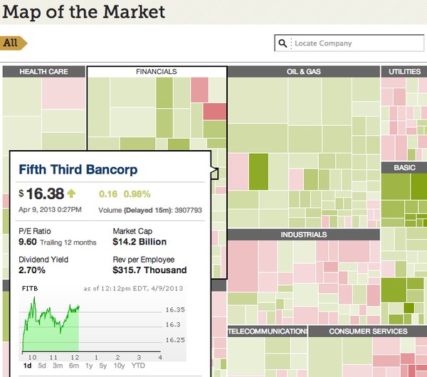
But even McCall admits that sometimes “the best solution may be to simplify thousands of numbers into a few relevant ones. This can actually be harder because you have to find that needle in the haystack and shine a light on it.”
The key to successful data presentations is, unsurprisingly, the data. This is why the producers of the best information graphics are as much researchers as they are designers. Tufte explains that at The New York Times, which he considers to produce the best visualizations of any media outlet, the designers are actually “Graphics News Reporters” and are responsible for gathering their own information.
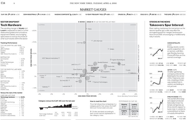
McCall helped redesign the financial pages at the Times and came up with a very simple device that placed a dot towards the left if the stock was trading at a low, or to the right if it was trading at a high giving context for the hundreds of numbers on the page with a minimal device. Great information graphics should strive for this kind of economy and make sure that the graphics do no obscure the information.
It is important for content producers to realize that popular infographics have become a form of “link bait” on the internet and it is not uncommon to see long scrolling “chartoons” (in Tufte’s words) about subjects that bear only a passing relationship to the company sponsoring them. Online eduction companies, in particular, have earned a bad reputation as abusers of this trend.
This is significant even for print projects because this style of presentation itself is gaining disreputable associations.
Tufte himself prepared detailed analyses after both the Challenger and Columbia space shuttle disasters that showed how the use of inaccurate information graphics obscured by “chartjunk” led NASA engineers to underestimate the risk of those launches. (The graphics in question were PowerPoint slides, and you don’t want to get Tufte going on PowerPoint!)
The same can happen to brands if they produce misleading graphic confections with facts cherry picked to support their own interests, in other words, disinformation graphics.
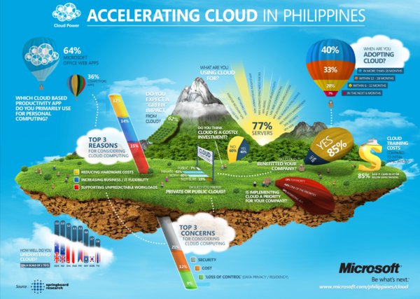
But even if you have your facts straight, overly illustrated data graphics, “chartoons,” trade analytical intelligence for anecdotal “coverage” of a topic. A fanciful image of a floating island in the clouds used by Microsoft to sell its cloud computing services in Asia, for example, is just an armature on which to hang numbers (localized, in fact, for different markets within the Asia Pacific region) where visual scale and quantity bear no relationship to the imposed data.
“I envision a future where we will develop different graphic languages and dialects specialized to a variety of fields.”
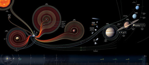
Contrast the meaningless cloud image with an even more beautiful rendering of the solar system created for National Geographic by Samuel Velasco of 5W Infographics, that renders the history of space exploration as an accumulation of lines from earth that curl around the moon, the planets and the sun. This design device is as stylized as any art nouveau floral motif, but it also communicates a lot of information in an intuitive, efficient and pleasurable way.
It is possible to take Tufte’s minimalism too seriously and forget to delight in the pursuit of big data. McCall offers an example of a graphic that he created for Gallup that achieves a density of more than 20,000 data points on a single page and communicates at a glance the historical arc of the presidency from FDR to Bill Clinton.
Contrast this to an attractive but lightweight take on the presidency through the eyes of their pets from veterinary content portal Vetstreet, which contains a whopping 22 facts in roughly twice the space of the Gallup graphic.
“Every day, we create 2.5 quintillion bytes of data, so much that 90% of the data in the world today has been created in the last two years alone.”
Both Tufte and McCall feel that content producers often underestimate the sophistication of their audience when it comes to information literacy. “Overload, clutter, and confusion are not attributes of information, they are failures of design,” Tufte says. “So if something is cluttered, fix your design, don’t throw out information. If something is confusing, don’t blame your victim—the audience—instead, fix the design. And if the numbers are boring, get better numbers.”
McCall explains that the ability to read, comprehend and create data visualizations is an emergent skill called graphicacy. “As the general public becomes more graphically literate, so are the data professionals. I envision a future where we will develop different graphic languages and dialects specialized to a variety of fields.”
Whatever your domain, there are visual forms that are well-suited to help your audience metabolize the big data that is now available, and it is your job to find or invent them. Properly formatted, big data can tell big stories. These visualizations “tap into the power of our visual cortex to absorb information at a much higher bandwidth than is possible through words and numbers alone,” says McCall. “It’s the only way for us to drink from this new fire hose of data.”
Get better at your job right now.
Read our monthly newsletter to master content marketing. It’s made for marketers, creators, and everyone in between.

