I  was taught as a baby designer to keep things simple and clean. Later, user experience study prompted me to make layouts that lead the eye effortlessly to important parts of the page.
Clients want lots of traffic to their sites and social media helps that to happen. Providing punters with easy ways to share content encourages that process – but it can also compromise the look and feel of a site.
The answer? Take control. Forget off-the-shelf icons, design your own buttons and integrate them thoughtfully and carefully. Here’s how.
Select the Best
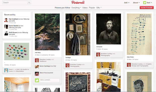
You don’t need a link to every single social media service online – just the ones with highest traffic referrals. Compact and bijou design is key.
The strategy will vary from site to site, but Twitter and Facebook are the must-haves. To cater to bloggers, you can add WordPress, Blogger and Tumblr to the list. If you’re down with early adopters, think Path and Pinterest.
And don’t forget to consider an email link — it’s the oldest social network there is.
Your True Colors
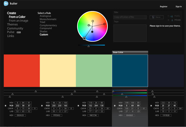
Here’s a choice to make any designer wince: do you upset the careful color balance of your site with a grid of candy hued icons, or do you risk reducing brand recognition with top social sites by applying your own color scheme?
I say, if you pick the best known social networks, their icons should survive any change of color scheme. The Twitter and Facebook icons are recognizable whether they’re rendered in regulation blue or gun-metal grey. Go for it.
Roll Your Own
The first rule of making your own social buttons, is not to reinvent them too much. If you deviate from the designs and iconography that people know, they’ll fail that all-important instant recognition test.
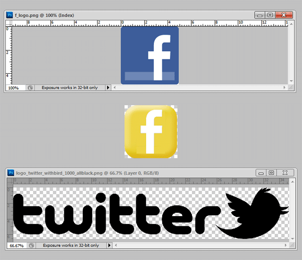
First, you’ll need the all-important Facebook “F” logo as an image. You can grab a version from Facebook’s branding page (I used the PNG version). Read the rules for use while you’re there. (By the way, you can find official branding livery for Twitter and Google, too.)
Start with a simple template at a standard size of 128×128 pixels in Photoshop, then drag in the Facebook logo on a new layer. Position and crop into the “F”.
You can experiment with blending and layer effects. In the example here, I’ve bevelled the layer with the rounded rectangle and blended the “F” logo using “divide.” I saved the whole thing out as a PSD file when I was happy with the overall look.
The template can easily be reused to make Twitter and Google+ icons. The icons themselves are saved as PNG files, using “Save for Web and Devices.”
In Plain Sight
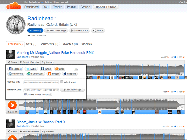
The alternative to color coded, ultra-discreet buttons that blend into your design? Hide your button collection in a pop-up. For example, SoundCloud uses a prominent, but discreet text link that simply says “Share.”
Follow its lead and you can keep your design clean and use the original livery of each social network. No mess, no clutter.
Implementing pop-up code with CSS is pretty easy. There are some neat examples at JavaScript Toolbox. Just place your social media buttons in the hidden DIV and you avoid compromise on every level.
And if creating your own buttons sounds less inviting than an afternoon breaking rocks, the web is chock full of ready to use social media buttons. Some of our favorites can be found on SixRevisions, PeachPoPs ElegantThemes.
Image courtesy of Flickr, chollingsworth3