The Evolution of Data Journalism
For publishers and brands alike, data is no longer considered a nice addition to your content strategy; it's essential to stand out.

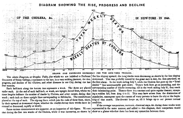
In the 19th century, the streets of New York City proved to be the perfect incubator for cholera. The disease made its debut during the summer of 1832, when 3,000 New Yorkers died within a few weeks. By 1849, more than 5,000 deaths could be traced back to cholera, becoming a full-blown epidemic.
To show when the disease was most rampant that year, the New York Tribune published a chart that compared weekly cholera deaths to total weekly deaths. This comparison helped readers see that while total deaths declined during the last week of June 1849, cholera deaths actually began to rise—a visual representation that hinted at the outbreak’s peak, which came a few weeks later.
By the 20th century, there was a noticeable shift in the way publishers used data. Instead of just plotting trends, individuals also collected data to make predictions. For example, in 1952, Navy mathematician Grace Murray Hopper and a team of programmers used voting statistics from earlier elections to predict Eisenhower’s win within one percentage point. This eagerness to predict elections was carried into the 21st century by FiveThirtyEight founder Nate Silver, who accurately predicted 49 out of 50 states during Obama’s first presidential bid. (Although Silver didn’t fair as well during the most recent election.)
If you trace these predictions, from the Tribune’s cholera chart to the mass of reports from this election season, we see how people have been interested in figuring out innovative ways to present data for well over a century. We’ve always wanted the who, what, where, and when, but audiences are very interested in the why. They want to see the context behind a particular moment and how it fits into a bigger picture.
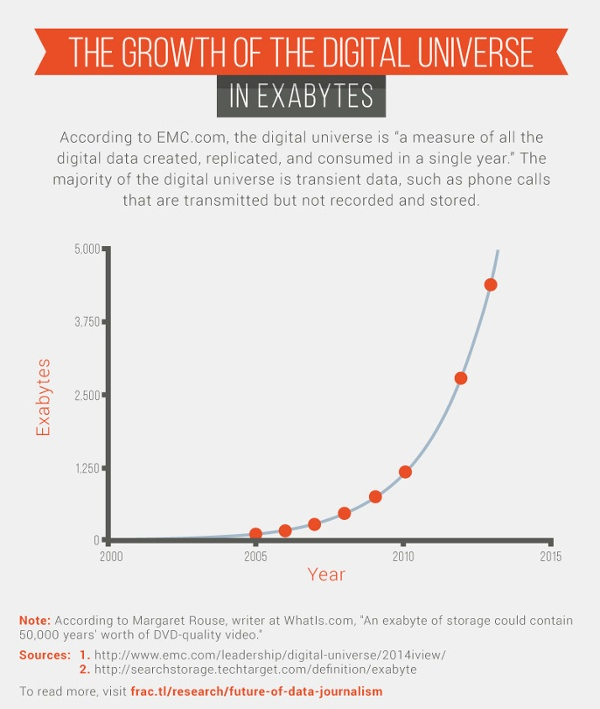
Luckily, there are plenty of opportunities to turn data into stories. Since 2005, the size of the digital universe (defined as all of the digital information that is created, replicated, and consumed in a single year) has grown by a factor of 33.
So what does this all mean in terms of successful content?
My team at Fractl recently spoke with reporters and strategists to learn more about how they produce data-driven content, where they find inspiration, and what they expect from the future of data journalism.
Letting data tell the story
“When we take on these sorts of projects, we put the story first rather than the technology,” said Nathaniel Lash, a data reporter for the Tampa Bay Times. Last year Lash used data journalism to take a closer look at the failure of a Florida school district.
In December 2007, the Pinellas County School Board resegregated its public schools, justifying its decision with the promise that schools in poorer neighborhoods would get more resources than those in more affluent areas. While collaborating with several reporters, Lash helped produce “Failure Factories,” a five-part series that synthesized more than five years of disastrous consequences into an engaging story.
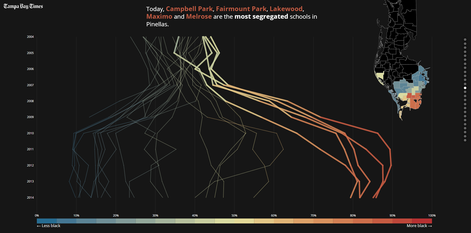
The project used an astronomical amount of data. As the first installment in the series pointed out, “Times reporters spent a year reviewing tens of thousands of pages of district documents, analyzing millions of computer records and interviewing parents of more than 100 current and former students. Then they crisscrossed the state to see how other school districts compared.”
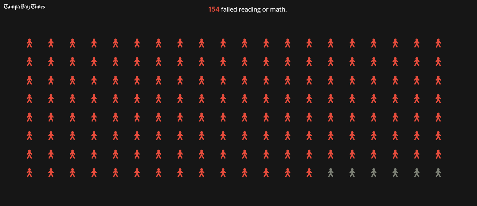
This massive amount of data was interesting, but unique visuals ultimately turned it into a noteworthy piece of work. The story nailed this concept from the very beginning with a prologue that focused on presenting tough facts—more than 80 percent of black elementary school students in Pinellas County, for instance, fail state standardized tests—through a powerful visual format. Placing the 154 students who failed their reading or math exams next to the six who passed is a tedious but poignant visual (see below).
There was also an emotional element to complement the data. The Tampa Bay Times included 31 stories from students. These types of emotional drivers helped readers become more invested in the project because they could connect with more than just statistics.
“Failure Factories” showed how a reporter’s nose for news can lead to more effective and thoughtful journalism when paired with data visualization that condenses mountains of data into a more digestible narrative.
Old dogs with new tricks
Back in 2007, The Tampa Bay Times, then known as the St. Petersburg Times, launched PolitiFact to verify politicians’ statements. PolitiFact took the traditional newspaper concept of fact checking and ushered it into the digital age.
On the site, staffers research statements and rate their accuracy using the “Truth-O-Meter.” Grades range from “true” to “pants on fire” based on public interviews, and the reporters publish a list of sources with every claim.
Consider a question President-elect Donald Trump tweeted back on Dec. 15, 2016: “If Russia, or some other entity, was hacking, why did the White House wait so long to act? Why did they only complain after Hillary lost?” Miriam Valverde, a PolitiFact reporter, cited multiple sources and referenced a transcript from the third presidential debate to debunk the question, giving the statement a “pants on fire” rating.
Due to these kinds of claims, the 2016 presidential election spurred a fact-check frenzy. Sites like PolitiFact experienced record-breaking traffic throughout the campaign. On September 27, the night of the first debate, PolitiFact generated more than 2 million pageviews, a single-day record for the site.
Andy Kirk, a UK-based freelancer who specializes in data visualizations, said that more traditional print publishers are a great source of data inspiration. “Newspapers are at the core of the very best practices in this field,” he said, pointing to publications like The New York Times, The Guardian, the Washington Post, the Wall Street Journal, and the South China Morning Post.
The New York Times and The Guardian are two high-profile publishers, in particular, that have taken the popularity of data journalism and cemented it in their newsrooms. In 2009, The Guardian launched its popular Datablog, and five years later, The New York Times followed suit with The Upshot. Four of the subjects we interviewed for this piece specifically mentioned The New York Times as one of their go-to sources for new ideas.
One of The Upshot’s more notable projects, published in 2014, took a closer look at how income influenced college enrollment. The interactive piece asked readers to draw a line that plotted parents’ income against the percent of children who attended college.
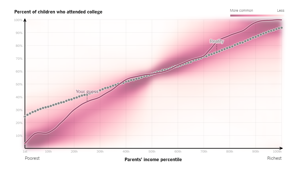
The graphic revealed how each respondent’s guess stacked up against the actual correlation. The move not only communicated important data, but also let the audience visualize its misperceptions, which is much more impactful than just writing out statistics in a text article.
How to stand out
Back in 2011, the Knight News Challenge gave $1.5 million dollars to projects it believed would facilitate data analysis. One such project, PANDA, equips newsrooms with a set of web-based tools that make it easier for journalists to craft data-driven stories. As of March 2014, the program was already available in 25 newsrooms across the United States.
The good news is that more information leads to an even playing field. High-quality data journalism is no longer exclusive to The New York Times or other publications with healthy budgets.
“Generally, we’ll see more,” said Matt Daniels, an editor at Polygraph, a publication that tells stories through data visualizations and animation. “Better tools lift the sea levels, and everyone’s ability improves.”
As more publishers look to invest in data storytelling, remember that there’s more than one way to tell a story. Think back to the Tampa Bay Times’ series on failing schools in one region. The Upshot recently ran a piece that told the same story, only not limited to schools within Florida’s borders.
It’s also worth noting that numbers aren’t essential. Although this might seem counterintuitive, some of the best visualizations are just that—great visuals. Consider “Perceptions of Perfection,” which the Fractl team created for our client Superdrug Online Doctor. We asked designers from 18 countries to Photoshop a model’s body so that she was “beautiful,” according to their different cultural standards. Although this wasn’t hard data, it did tell a unique story. Relaying those standards, which wasn’t quantified like a typical data source, still led to more than 900,000 social shares.
Lastly, keep in mind that not everyone is a data nerd. A great data set won’t go anywhere if it’s difficult to understand. Last April, Matt Daniels and Hanah Anderson published a Polygraph story that explored Hollywood’s tendency to overproduce movies dominated by white males. They were working with a daunting data set of 2,000 screenplays, which could’ve gotten overwhelming, but they broke it down in a digestible way, relying on familiar cues like blue shading for males and red shading for females, which made it easier to comprehend the gender disparity across dialogue, character balance, and box-office results.
For publishers and brands alike, data is no longer considered a nice addition to your content strategy; it’s essential to stand out. Many publishers like to revert to text articles because they’re familiar, but data has given us new ways to provide context and clarity to our most powerful narratives.