Brands
Presidential Attack Ads: Calibrating Content for Divided Attention
As part of the Content Campaign ’12 Series, The Content Strategist examines the content published by the presidential campaigns as part of their strategy to win November’s general election.
This week the presidential candidates released two new attacks. Barack Obama says Mitt Romney is going to raise taxes for the middle class. Romney says Obama is undoing welfare reform.
 Turns out neither are fully paying attention to how Americans don’t pay full attention.
To help dissect the effectiveness of the candidates’ content strategy, The Content Strategist spoke with Ian Alexander, cofounder of digital content agency Eat Media.
While Alexander said he’s never voted, he does consume a lot of content and specializes in solving problems across media. Indeed, we shared his attention with his computer, his cell phone and his tablet.
Many Americans operate similarly.
According to a recent Nielsen study, 86 percent of smartphone owners and 88 percent of tablet owners use those devices while also watching TV, contributing to what Alexander refers to as a “three-screen world.”
Video
Americans’ divided attention doesn’t bode well for the candidates and their recent video attacks, which Alexander said do a disservice to digital multitaskers.
Romney’s video discusses Obama’s plan in text while showing Obama, Bill Clinton and workers. Only at the end do we see Romney. The video tries to convey that Obama will get rid of the work requirements Clinton created in 1996.
The ad introduces too many important characters too quickly: Clinton, a bipartisan congress, Obama and Romney all within 30 seconds. Alexander said commercials are too short to introduce multiple characters without causing confusion.
The effect for those who are watching and listening intermittently is also confusing.
“There’s a contradiction of between the imagery and the text,” Alexander said. “It gets my attention when it says ‘Obama guts welfare reform,’ but then loses it when I see the imagery of people working,” he said. “Why are these people happily working and getting a welfare check?”
“The first woman looks like someone you’d pass at the market, who you’d see 100 times a day,” Alexander said of the second iPad users. “She doesn’t have time to give you a bullshit answer.”
The people on the street motif, Alexander said, is a good way to relate to viewers and get their attention.
The trouble with the Obama ad is it’s not very clear to multitaskers whose ad it is. “Romneyplan.org,” which is a link to the tax calculator, is constant on the screen. The Obama/Biden logo doesn’t come up until the end.
“If I miss the first six seconds, the first thing that pops up is romneyplan.org, which is not really positive or negative,” Alexander said. “I could very seriously see that and think that’s Romney’s calculator.”
Text
A major tenet of content strategy is backing up your claims. Online publication provides a quick, easy and cheap way for candidates to bulwark their messages. The trick is to attach the message to the candidate.
The majority of Romney’s criticism of Obama pushes Romney’s messages, not the candidate himself. This could be effective, except that the way the message is presented — that Obama is going to ruin welfare reform — isn’t presently clearly, leaving readers without a strong message or a candidate to back.
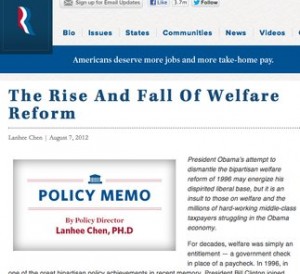
Romney’s policy memo is very text heavy and his name is buried.
 “If people are really going to read this, it has to [be formatted in] more chunks,” Alexander said. “Give me some talking points—tweetable points that I can use.”
Alexander said text-heavy content like this is passive and isn’t easily read nor shared. “They are not making the content work for them,” he said. In this case, it’s not even clear who the “them” are.
Like much of his website, only a stylized red, white and blue “R” denotes it as Romney’s.
Obama is mentioned much more prominently in the text and is the only person pictured. To make matters worse, if you scroll to the bottom you see, “Help Us Make Barack Obama a One-Term President,” which skimmers can easily misread as pro-Obama.
As he’s been doing consistently on his website, Romney leverages big guns, using Republican politicians and other big names to make his points. Romney’s campaign backs up his welfare claims using three separate op-eds by Republican politicians: Virginia Gov. Bob McDonnell, Texas US Senate candidate Ted Cruz and Ohio US Congressman Jim Jordan.
 “Having someone who’s in the industry brings more clout,” Alexander said. “The problem lies when it’s the only source of providing content to people,” he added, saying that both Romney and everyday people are noticeably lacking from his campaign content.
Obama uses a much more varied and effective text strategy to prove his accusations about Romney’s tax policy.
Obama’s National Policy Director James Kvaal summarizes Romney’s plan in tweetable segmented text, bolding the main talking points. He also gives a quick roundup of media soundbites to give an outside perspective.

Additionally, the source of the information is nonpartisan Tax Policy Center, which makes the campaign’s conclusions about Romney’s tax plan seem more trustworthy than if it were coming from a Democratic talking head.
Lastly, Obama uses a series of quotes from presumably middle class constituents who discuss how they’d use the money the save on taxes with Obama. They mention saving for kids and college, and paying off student loans. Alexander says theses short, relatable quotes can be very effective.
“‘Oh, a baby? I can relate to that,'” he said, mimicking his and other viewers’ experience. “It’s such an emotional pull that I’m more inclined to care.”
Interactive
Good interactive design makes people want to use it — and thus inherently engages them.
 “Interactive, for better or worse, is like a shiny object: ‘Let me play with that,'” Alexander said.
So far in this bout of attacks, Romney has not added an interactive element.
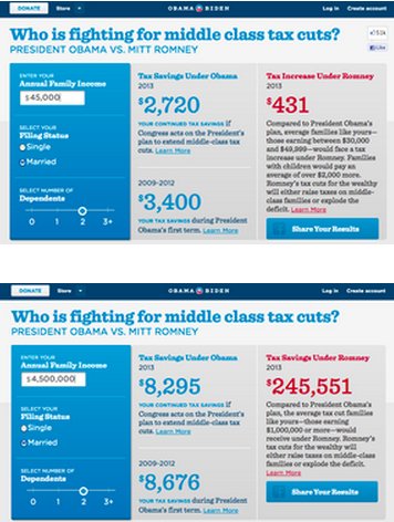
Obama has consistently dominated the interactive field and does so again with an income tax calculator. It lets users enter in their income to see the difference in their taxes under Obama and Romney.
Obama uses the interactive calculator to help make his point, and successful interactive design, Alexander said, is a great way to get your point across.
“I’m forced to engage, so now you have my attention,” he said. And attention is what each candidate should be going for.
Get better at your job right now.
Read our monthly newsletter to master content marketing. It’s made for marketers, creators, and everyone in between.


