Why Heat Maps Reveal True Engagement: Using Docalytics To Understand Reader Journeys
PDFs? We don't know her. Discover how our Docalytics heat map tool reveals user engagement data for your downloadable content, providing actionable insights for content optimization.

Heat maps are a powerful tool that can help content marketers understand how their audience is interacting with their content. By tracking where users click, scroll, and spend time, heat maps can reveal insights to improve content’s overall effectiveness.
Beyond whether users downloaded the content or not, gaining this level of understanding from downloadable content like white papers, sales collateral, and guides has historically proved challenging. Let’s take a look at how Contently’s proprietary Docalytics tool can bridge the gap to unlock your content’s hidden insights.
What Are Heat Maps and What Do They Track?
A heat map is a visual representation of user engagement with a website or piece of content. Heat maps use color to indicate where users are interacting with the content, with warmer colors showing more interaction and cooler colors indicating less interaction.
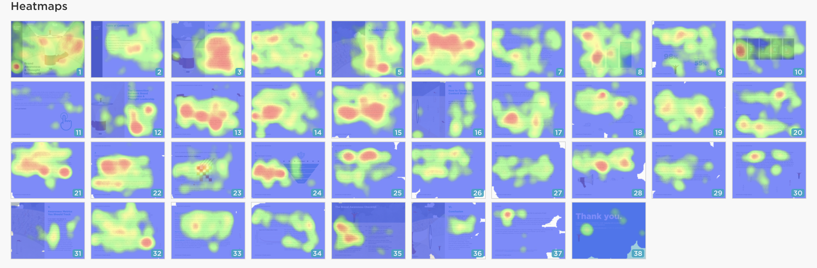
Within Docalytics, heat maps turn downloadable content into dynamic, trackable web assets that provide valuable page-by-page engagement and user interaction data. Having visibility into where users move their mouse and click—and where they don’t—gives content marketers immediate insights into the type of content that resonates with readers and areas that need further optimization.
Analyze Docalytics’ Full Engagement Data to Drive Content ROI
In addition to heat maps, Docalytics provides additional analytics that allow content marketers to identify content trends and opportunities at the page and document level.

Document Metrics
- People: The number of unique visitors that have viewed the content.
- Engaged: Percentage of visitors that spent 15 seconds or longer on the content piece.
- Average Time: The average amount of time visitors viewed the document.
- Average Finish: How far visitors are scrolling through the content PDF.
- Attention: The total amount of active time users interact with the content. This doesn’t include any time that the page was idle.
- Downloads: The number of times users downloaded the PDF to their desktop.
- Prints: The number of times users printed the content document.
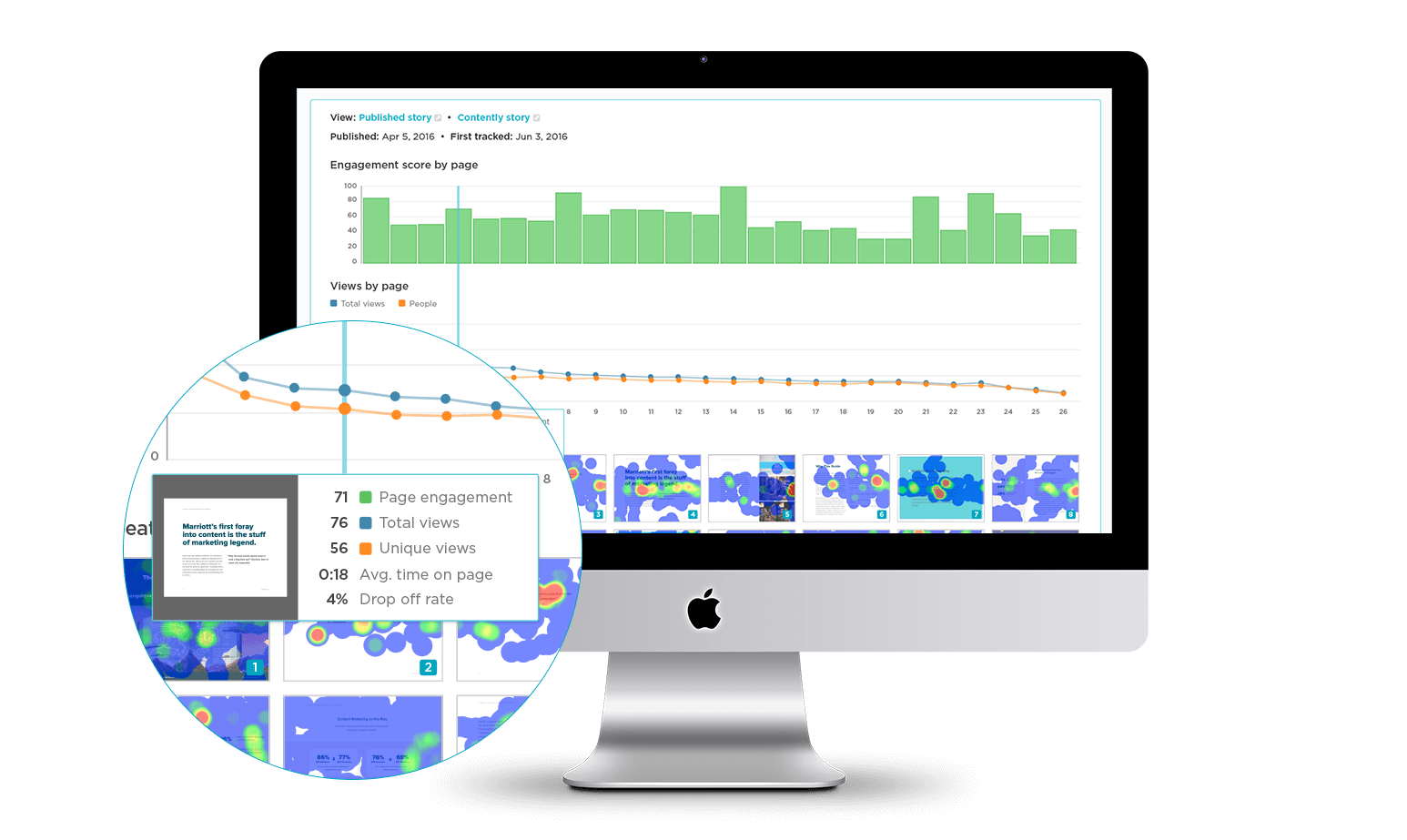
Page-by-Page Metrics
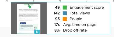
- Engagement Score by Page: This bar graph gives you a quick visual comparison to see which pages had higher or lower engagement. Mousing over the graph provides details on the score, total page views, number of unique users, average time on page, and drop-off rate.
- Views by Page: This line graph lets you quickly see which pages had the most views and unique users and where they started to drop off.
Use Docalytics Heat Maps to Optimize Content
Heat maps offer a multitude of strategies to enhance your content marketing efforts. Let’s explore a few of these potential applications.
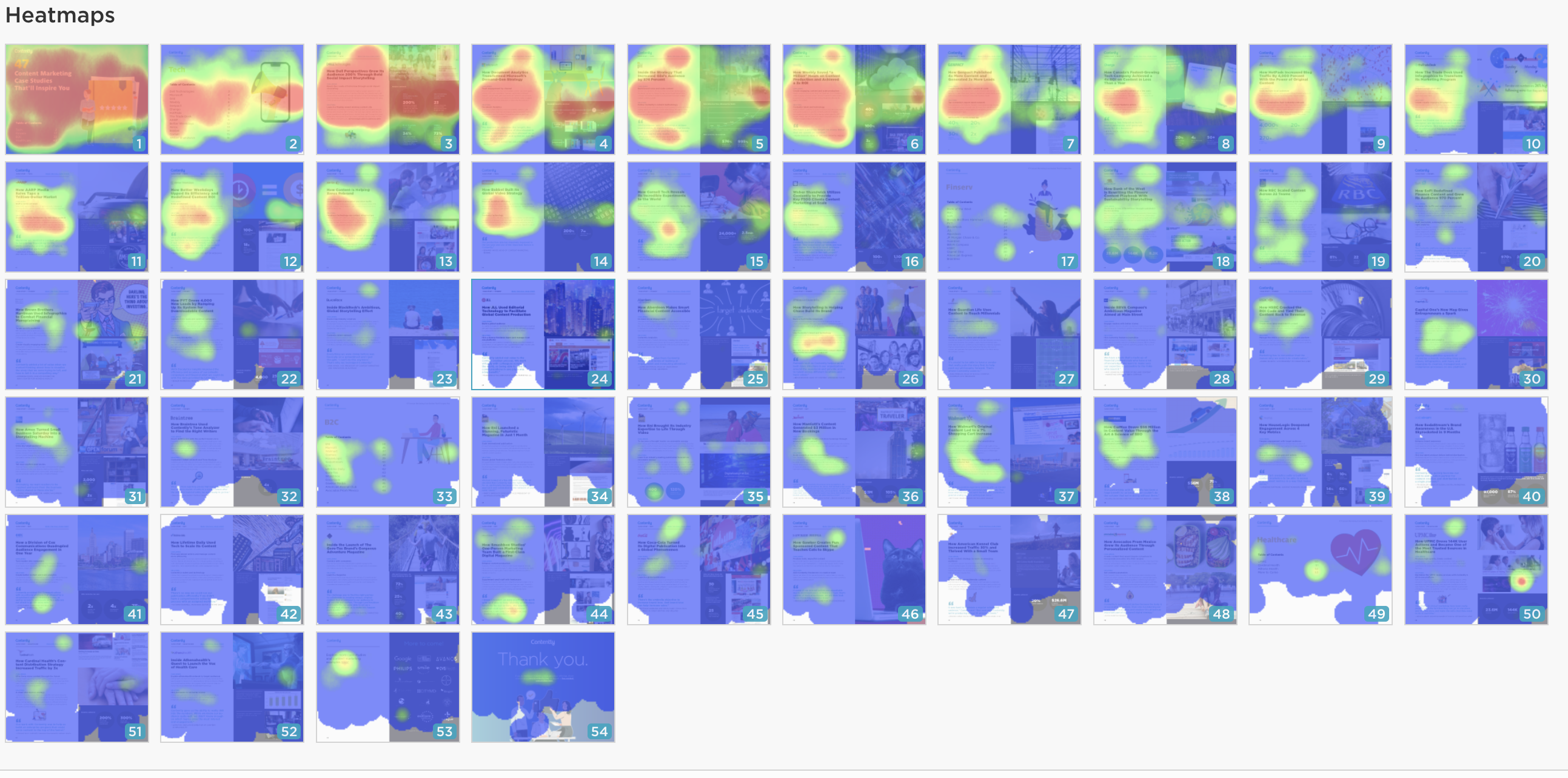
1. Dive Deeper Into High-Engagement Areas
Heat maps can help you identify areas of your content that are most engaging. This information can be used to focus your content marketing efforts on these areas. For example, if you see that users are spending a lot of time on a particular section of your content, you may want to create more content that is similar to that section.
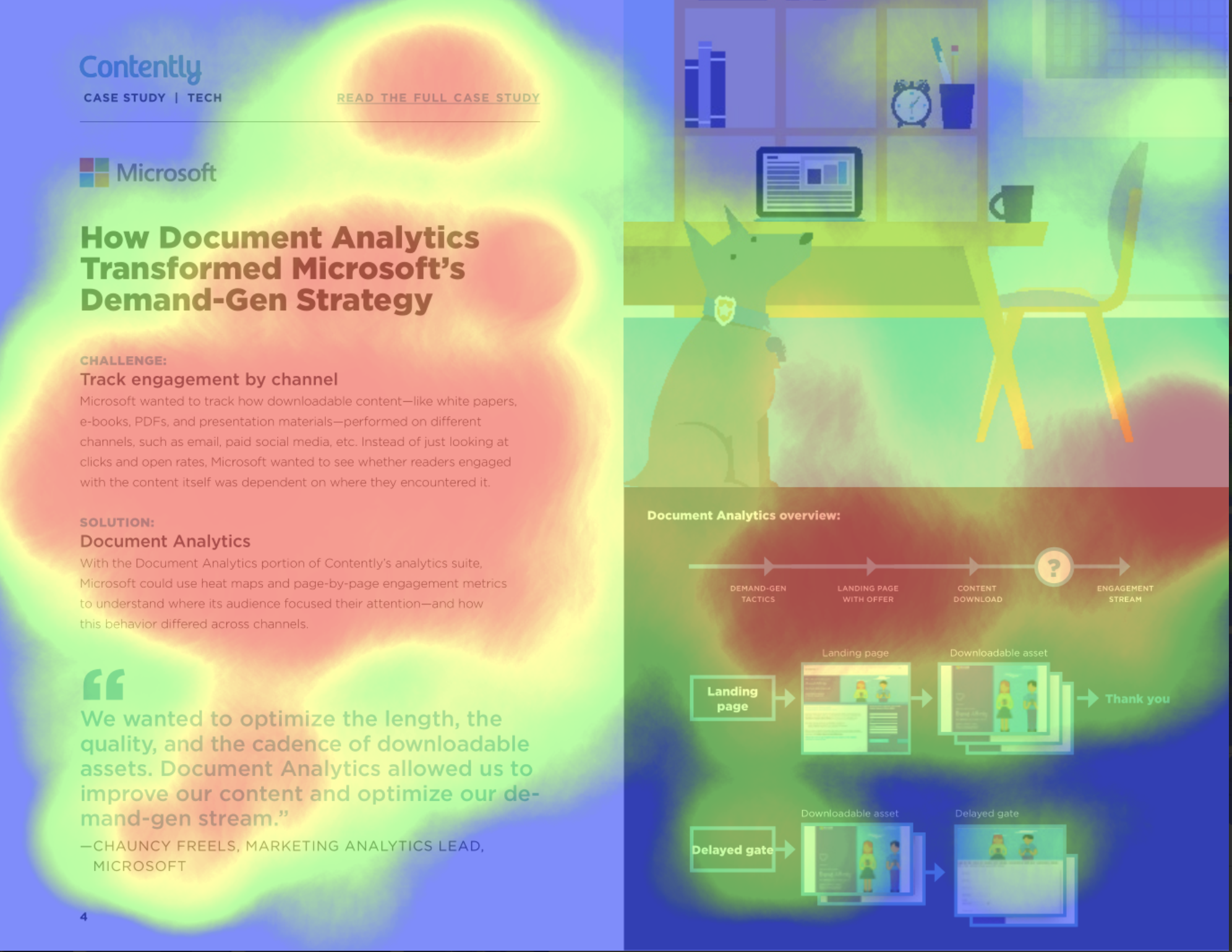
This Microsoft case study page, for example, illustrates that readers were particularly interested in learning about their content engagement tracking challenge, document analytics solution, and Microsoft’s document analysis flow.
These hot spots indicate potential interest in additional content that explores related topics. They also indicate that the right side of the page may be more effective and engaging if we reduced the illustration and added more commentary about the document analysis.
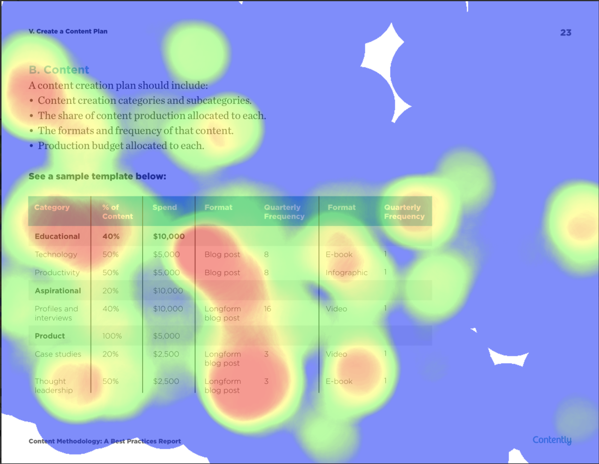
We see in our Content Methodology Report that the table column about content format and frequency had high engagement. Based on the shape, we can hypothesize that users selected, copied, and pasted the column information for later reference. This points to potential interest in a detailed blog post about editorial calendars, content types, and publishing frequency.
2. Identify Drop Off and Iterate
Analyzing low-engagement areas can unlock optimization opportunities and provide additional insights. Downloadable content that has large spans of low engagement could indicate that readers are scrolling past the content.
If that’s the case, you should ask yourself whether you want to improve the content on each page or if the asset is too long and you should cut pages. In fact, the graph above the asset will give you an average drop-off rate by page so you can assess where you lose most of the readers, enabling you to shorten and optimize your content for better impact.
3. Optimize Visual Content or Link Placement
In other cases, you may notice that users aren’t interacting with embedded links or large content areas, which may necessitate copy or design changes. But you may also come across instances of high engagement that point to a misalignment in user experience.
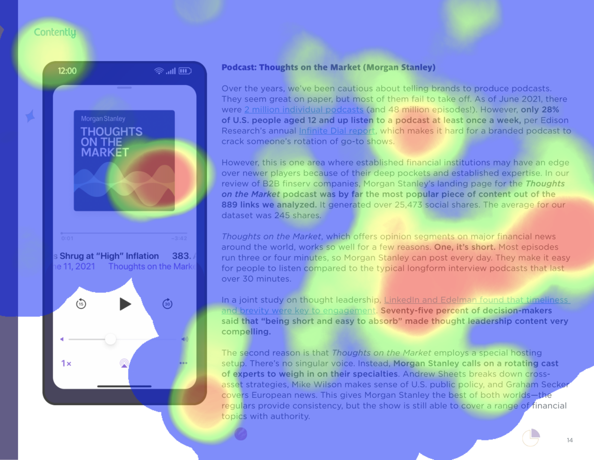
The hot spot on the smartphone graphic above may indicate that readers expected to click the image and navigate directly to the Morgan Stanley podcast. Using this insight, the marketing team could decide to update the download to include a link or revise the graphic to eliminate confusion.
Strengths and Weaknesses in Your Downloadable Content
Contently’s Docalytics tool can be a game-changer in your content marketing strategy. By tracking and visualizing how users engage with your downloadable content, heat maps uncover both the strengths and weaknesses in your content pieces, helping you fine-tune your approach to maximize ROI.
From identifying high-engagement areas to recognizing aspects that need enhancement, heat maps illuminate the path to deeper engagement and more effective content marketing. And now your content’s hidden insights are waiting to be discovered with Contently’s Docalytics. Transform static documents into dynamic, data-rich assets that can drive content marketing success.
Schedule a demo of Contenly’s content marketing platform to learn more about how Docalytics heat maps can help you improve your content marketing ROI.