Brands
The Best Content Marketing of July: The Marketing Machine Never Stops
July is usually the slow month. After marketers drag themselves back from Cannes with overly tan faces and suitcases full of wrinkled linens, they need a breather. People go on vacation after their vacation. Joe Lazauskas, our editor-in-chief, started wearing boat shoes. Q3 can start off slowly as people work themselves back into game shape.
But the marketing machine never stops. Since some companies decide to focus their midyear efforts on France, July can emerge as a white space full of opportunity for others. There were plenty of great stories that debuted within the last few weeks, but without further ado, here are the best of the best.
Etsy: How a Mother’s Etsy Shop Saved Her Family From Eviction

When it comes to storytelling, some brands are luckier than others. If you’re a fast food chain, there are only so many topics you can cover with credibility. But if you’re a giant like Amazon or Google that can theoretically cover just about anything, it can be tough to have a focused identity. Google, for example, has had a number of outstanding pieces of content, but it covers so much that it’s hard to pin down what type of story works best for the brand.
Etsy is a great example of what can happen when a company exists in that sweet spot. The brand’s blog, Journal, is an exercise in consistency. Articles cover do-it-yourself tips, shopping guides, and, best of all, entrepreneur profiles. These profiles are a perfect fit, letting Etsy write about a variety of products and shops while revealing the stories of people who have helped the platform thrive.
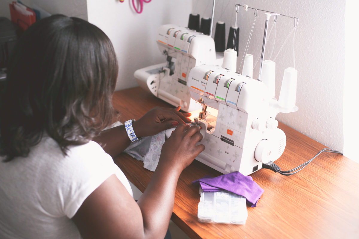
Last month, Etsy published a touching profile about a woman in Texas who turned to Etsy as a last-ditch effort to provide for her family. By selling rompers for kids, she made enough money to keep her husband and kids in their apartment, and eventually became the family’s breadwinner. Comments sections are usually terrible, but this particular piece has 53 comments, and all of them are overwhelmingly positive. Only a truly great story can have that kind of impact.
Warby Parker: The Great American Solar Eclipse
On August 21, the United States will have a front row seat to a total solar eclipse. I’m not entirely sure how that works—Astronomy was the one class I dropped in college—but, based on some quick Google research I do know that a total eclipse hasn’t crossed the U.S. since 1979. And whenever something hasn’t happened for 40 years, people will undoubtedly spend a few days caring about it until the next thing comes along.
For that reason, Warby Parker’s decision to put the first stake in the ground for the upcoming eclipse caught my attention. The eyeglasses company built a dedicated page on its site to “The Great American Solar Eclipse,” which includes some succinct info on what’s happening, a downloadable pinhole projector, a clear CTA for free eclipse glasses designed to bring traffic into Warby stores, and a parody music video set to the ’80s hit “Total Eclipse of the Heart.” It’s really everything an astronomical dropout like me could need to care.
Muzzle: Homepage

I’m not sure if homepage copy counts as content. If it’s the typical wasteland of vague adjectives and bland slogans, then probably not. But, humor me here, if a brand can set up a homepage that draws you in, then it deserves the credit.
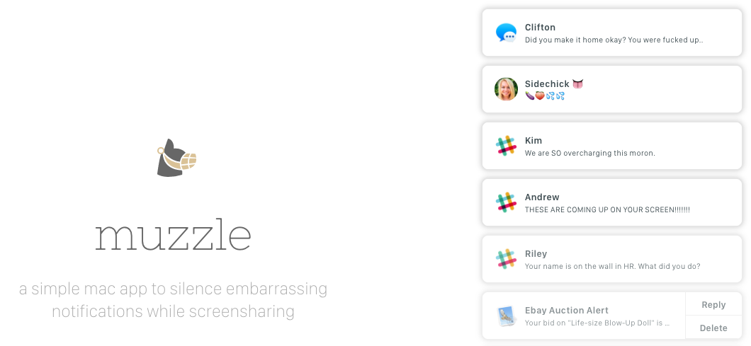
Muzzle, a new app that prevents notifications from showing up while you’re screensharing, does just that. Muzzle’s site is extremely simple—the only action you can really take is to click on the “Download” button—but on the right side of the homepage, unseemly notifications start to trickle down the page. (One of the milder examples: “Sweetie, it’s okay. It happens to every guy sometimes.”)
According to Bryan Jones, the developer, the site has an absurd 23 percent conversion rate. Apparently there are a lot of people who are worried about getting fired during meetings. As Jones told Adweek: “The app is good, sure, but without the, ‘Oh my god you have to see this website!’ element, we would never have spread beyond a small circle of friends and maybe a few of my followers.”
Vox Creative & Capital One: This Dallas Restaurant Is Transforming Lives — and Community

In her newsletter “The Overlap League,” branded content consultant and longtime TCS contributor Melanie Deziel featured this project as one of the top native campaigns from the last month. “Financial brands get a bad reputation in the content world for being tough to work with and bogged down by lengthy legal approvals,” Deziel wrote, “but they often have some of the best opportunities to ‘show, don’t tell.'”
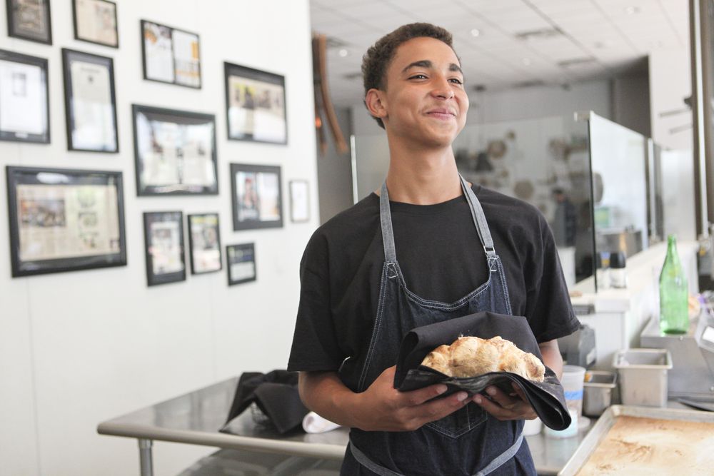
Capital One worked with Vox to take advantage of that opportunity, producing a longform narrative, full of vibrant photography, about a Dallas restaurateur who opened a cafe that helps at-risk kids get internships in the kitchen and access to resources for housing, parenting classes, and more.
[Full disclosure: Contently works with two divisions of Capital One but does not manage any of the company’s native content.]
Highlighting these initiatives will always be important, regardless of whether or not a brand is behind the content. But as financial institutions continue to try to woo small businesses, it pays for a company like Capital One to be a champion of these stories, showing (not telling) future clients that it cares.
Equinox: My Body Experiment: Bikini Competition

I know what you’re thinking—putting Equinox and bikini in the same sentence is a recipe for chauvinistic disaster. But this first-person essay on Furthermore, Equinox’s blog, is not what you’d expect from the same company known for billboards that aren’t safe for work, lunch, driving, or any other activity out in the world.
Simone Tchouke, an Equinox trainer, recounts her background as an African immigrant who eventually fell in love with exercise and weight training, before detailing the extreme physical process she goes through to compete in a bikini competition. (She refers to it as “beauty pageants for muscles.”) The end result is far from glamorous. It’s both tactical and highly personal, and ends with a surprising take from Simone about her future as a competitor.
The Equinox brand needed a makeover. Perhaps this emphasis on wellness and extreme fitness is how the company can reinvent itself to be more accessible. It’ll have to do more than publish a few articles to find a new identity, but this piece of content is in stark contrast to the 200-foot billboard of a model breastfeeding twins. As people are sailing through summer and the marketing scene is fairly quiet, now’s the time for brands to make their mark.
Image by Warby ParkerGet better at your job right now.
Read our monthly newsletter to master content marketing. It’s made for marketers, creators, and everyone in between.


