ROI
How to Build a Better Lead Form
This story is part of Contently’s Accountable Content Series, a collection of articles, webinars, case studies, and events we’ve designed to help marketers deliver measurable brand impact and business outcomes with content. To see more content in this series, click here.
Say you’re walking on the sidewalk, minding your own business on the way back from lunch, when you lock eyes with a street canvasser. The canvasser, dressed in some ill-fitting mesh vest and a visor, gets ready to sell you on a good cause. You want to support the cause, but you also hate the intrusion of the hard sell and don’t want to give away your personal information. She opens her mouth to initiate small talk, but you walk right by, avoiding eye contact and trying to stifle the guilt.
Lead forms are the canvassers of the marketing world. In any exchange of value, both sides need to evaluate whether they’re getting something useful in return. On the street, it’s not worth it for most people to take out a credit card and hand over sensitive information to donate to a charity when they can just do so on the computer in their homes. Perhaps if the canvassers only wanted a name or an email address, they’d have more access. Likewise, when brands and publishers gate their content, the success of an e-book or a video will likely come down to how much they ask for in return.
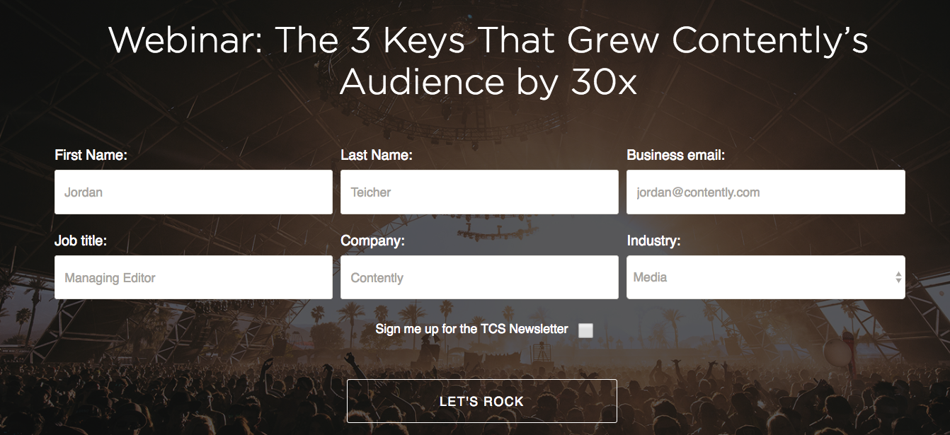
How many fields should you include in the lead form? What do you prioritize? Should you ask for a phone number? Do you need to care about age? Location? What about placement—do you want the form to be the first thing someone sees on a web page?
Here’s an example of a lead form we use on The Content Strategist:
Despite looking fairly basic, a lead form comes with its own special sort of marketing calculus. Even if you have a brilliant piece of content hiding behind the gate, nobody is going to see it if you turn people away by asking for too much information on a form.
Research from Docalytics, an analytics and tracking company acquired by Contently in 2016, found that forms with only three fields have an average conversion rate of 25 percent, but that rate drops to 15 percent for forms with six or more fields.
“I think the perfect ideal scenario is to start with an email address,” said Jason Miller, global content marketing leader at LinkedIn. “Then keep that person engaged with content and you progress your profiling, taking a little bit of information each time.”
In 2011, Marketo conducted a study on different lead forms and found that shorter forms of five fields outperform longer forms of seven or nine fields. A five-field form had a cost-per-lead of $31.24, while the cost-per-lead was $34.94 for seven fields and $41.90 for nine fields. The shorter form also boasted a 13.4 percent conversion rate while the other two options were both under 12 percent.
If marketers want to maximize how many leads they bring in, then they have to be economical with their forms. Certain third-party tools, like Clearbit, can look up a person’s information off of an email. Others, including Marketo, can pinpoint a user’s approximate location from an IP address, which means you won’t need to ask for an address.
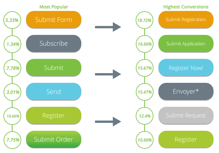
Another way to get more people to fill out a form and download your content is to optimize the call-to-action (CTA). Marketers would be wise to do a little research rather than going off of intuition, because one word can have a big impact on your conversion rate.
Three years ago, Formstack, a form builder software company, surveyed 400,000 people and found that the most common CTA button copy—words like “Submit,” “Subscribe,” and “Send”—weren’t the most effective ways to drive leads. Simply changing a button that read “Register” to “Register Now!” improved conversions by five percentage points.

Image via Formstack
It’s in your best interest to make the process as simple as possible for anyone who comes across your lead form. Add an auto-fill functionality so potential leads don’t have to waste time typing in their names and contact information. Perhaps you can offer an external log-in option, which lets your audience fill forms with social profiles on networks like Facebook and Twitter. These may seem like minor tweaks, but when you’re making that hard sell, each second matters.
This is an excerpt from “The Content Marketer’s Guide to Lead Generation.”
Image by Gemenacom / GettyGet better at your job right now.
Read our monthly newsletter to master content marketing. It’s made for marketers, creators, and everyone in between.


