5 Content Design Lessons For Brand Publishers
"Content is king" is so 2012. Try this one on for size: "Design protects the castle." Thankfully, designers are sharing their lessons and experiences online.
“Content is king” is so 2012. Try this one on for size: “Design protects the castle.” From younger media companies like Flipboard to established royalty like The New York Times, innovative page designs have turned traditional writing into striking visual experiences.While aesthetics don’t directly generate sales, it would be foolish to dismiss design’s ROI, since it keeps editorial relevant and attracts attention—two scare commodities in today’s media ecosystem. However, design continues to be an overlooked element in brand publishing.
Thankfully, designers are sharing their lessons and experiences online. Listen up— it’s time to learn from the pros:
1) Embrace the super article

The New York Times’ Snow Fall article has dramatically changed the way publishers and designers conceptualize article presentation. Perhaps most importantly, it is an example of a good user experience attracting readers and keeping them fixated. As digital designer and developer Luke Seemann told the Society of News Design: “I theorize that the best way to get readers to spend more time on your site — and in turn engage in the things that pay the bills — is to give them an awesome experience in the first place…”
Recently, Seemann decided to apply this principle to Chicago Magazine’s redesign. Since data suggested related posts (i.e., “You may also like…”) weren’t engaging viewers, he realized readers didn’t need hand-holding to find new articles; so, Seemann opted to craft experiences they find organically, instead. Rather than using an algorithm to lead users around the site, Seemann executed on his belief that beautiful designs and engaging articles would make users curious enough to browse Chicago Magazine on their own initiative.
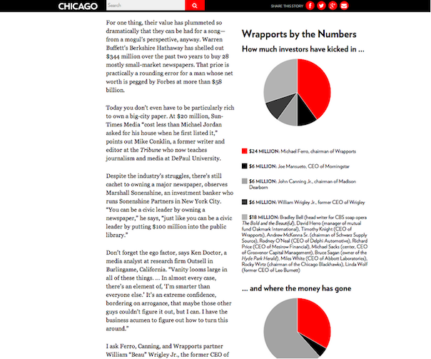
Via Chicago Magazine
This vision led Seemann to create concepts like what he calls the super article. While Chicago Magazine doesn’t completely replicate the visual effects (e.g., parallax, videos) of Snowfall, the publication does put more resources into crafting certain online features. These super articles appear a few times per month and feature bigger photos, better charts, and a more tailored design (here are two examples).
Brands are throwing their hats into the ring, too. Converse partnered with Complex on “The New New” — an interactive piece looking at hustling artists and entrepreneurs. And Shoplocket rocked the super-article game with a visually-stunning profile of Stephen Lake, the creator of the MYO Armband.
2. Your user experience is a weapon
While there is more content available than ever before, making the information accessible can be a challenge for publishers. In an economy where attention is the scarcest resource, user experience and design can serve as the Trojan Horse that piques reader curiosity.
Christian Crumlish, former Director of Consumer Experience at AOL, explains in an interview with O’Reilly Radar how good UX can differentiate websites and content from less thoughtful competitors. The design and development team brings together the many aspects of problem-solving, ideation, visualization, communication, and innovation to create a solution that entices the reader.
While the content itself is crucial territory for publications to differentiate themselves from competitors, UX is another opportunity to make a difference to readers. When handled poorly, it can also be your Achilles heel. Crumlish and his peer, Erin Malone, speak further on how to use UX as a weapon in this Web 2.0 Expo lecture.
3. One primary action per screen
When you’re working with great content and a healthy budget, leveraging each piece to maximize the number of call-to-actions may seem easy. Let’s insert more Related Articles here, or more opt-in boxes there. Let’s figure out how to name-drop every single relevant product in this content. However, this temptation can be also extremely confusing and overwhelming to readers if you bombard them with all CTAs. Instead, prioritize and clarify. Remove all elements until you figure out the most important one – then emphasize that action.
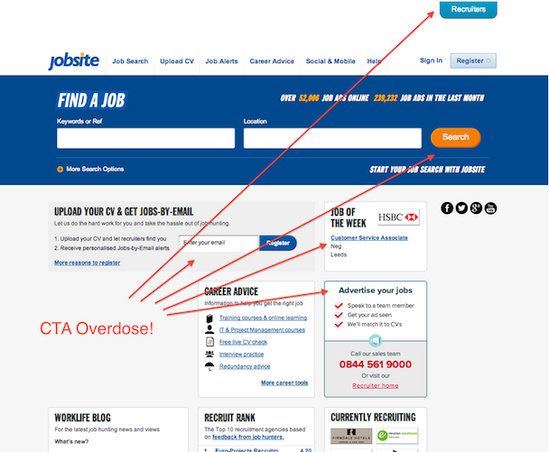
Visit: http://www.jobsite.co.uk/
As this eConsultancy article explains your CTA should specify things like: What is the reader signing up for? How will they benefit from signing up? Why should they care?
Once you figure out your primary action, you can still have a few secondary actions, but make sure the reader knows they’re secondary. As Joshua Porter, Director of UX at Hubspot, writes:
“The reason why your article exists isn’t so that people can share it on Twitter…it exists for people to read and understand it. Keep secondary actions secondary by making them lighter weight visually or shown after the primary action has been achieved.”
4. Use Your White Space Effectively
Far from being wasted space, white space is a crucial element in content marketing. Because content is the focus of the page, white space communicates implicitly to readers. It naturally guides users, helps them navigate the website, and can also minimize confusion and effort required on readers’ ends.
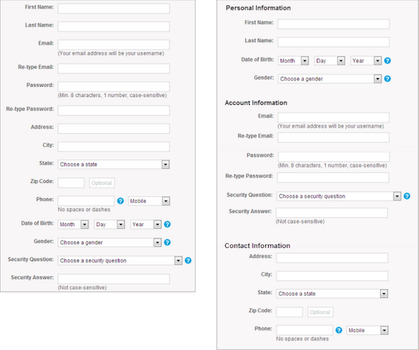
White space is important not only for article pages, but also lead generation. Grouping together related fields can make it appear as though they are fewer objects, because our brains see groups of objects as one object. (The Gestalt Principle explains how this works). Grouping sign-up forms into sections — Personal Information, Contact Information, Account Information — instead of displaying separate fields individually is one way to simplify visual spacing.
5. Use viral colors
Standing out doesn’t always require super articles or a massive redesign. Sometimes, smart, simple multimedia can turn eyeballs to your work. Pictures and photographs are essential hooks that help capture reader attention. Images are also a powerful communication tool for reaching the masses who see them on Facebook, Twitter, and various forms of social media.

Source: Virality Score, Medium
In a week-long analysis of tens of thousands of viral articles, Virality Score determined the most viral colors on the web: blue and orange — a complementary set of colors. Blue was particularly popular, a cool color for readers heading into winter season.
Writers can break down photos by colors and determine which are best for their audiences. Data such as pageviews, engagement, time on page, and on-page activity can provide feedback and guide more informed decisions in the future, regardless of a writer’s photography skills.
Closing thoughts
These design lessons pay off in dividends whether you’re a veteran media company or another content marketing initiative. Even a rudimentary consideration and understanding of design can spark lasting curiosity from readers. Colors, white space, and clarity are the new weapons of brand publishing. Use them wisely.
What’s the deal with the Content Strategist? It’s something we created at Contently because we believe in a world where marketing is helpful, and businesses grow by telling stories that people love. Take advantage of our tools and talent and come build that world with us.