Brands
Chartbuilder Will Make You Feel Like a Graphics God (But Won’t Make You Jump Off A Roof Into A Swimming Pool)
It’s no secret that visual content is a big key to unlocking brand engagement. A study by MBooth and Simply Measure examined the top 10 brands on Facebook and found that users liked photos twice as often as text updates and shared videos 12 times more than photo and text posts combined.
At the moment, the entire social media ecosystem is trending towards visual content, with Pinterest topping the content-sharing charts, Facebook making Timeline more visual, and Instagram and Snapchat growing at rapid rates. The only problem for brands: Creating quality visual content usually doesn’t come cheap. Designers and data specialists often need to be contracted just to make a chart. So how can brands create content cheaper and more efficiently?
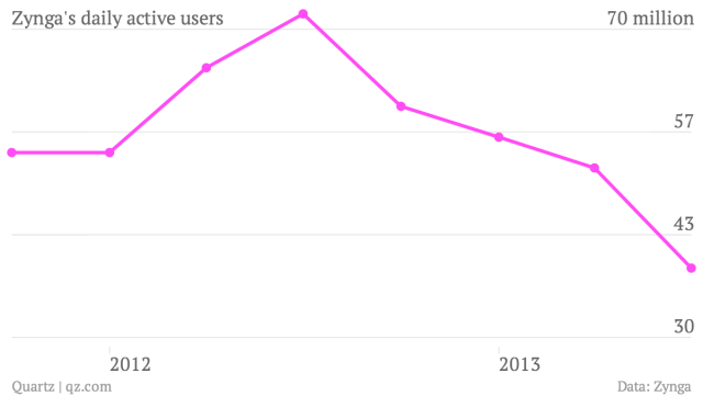
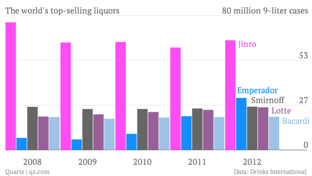
Chartbuilder, a tool recently released by Quartz, may be one solution.
Like most great tools, Chartbuilder was created out of necessity; the publication’s graphics desk was overloaded with small requests, and they needed a tool that allowed reporters to create beautiful charts on their own by simply plotting some basic information onto X and Y axes.
So far, the tool has gotten rave reviews. It topped the charts on Github (no pun intended) and is now being used by NPR and CNBC. For brand newsrooms of all sizes, Chartbuilder is an intriguing (and free!) way to create handsome content.
And since Chartbuilder is open code, publishers can customize it to best fit their site. “Fonts, colors, sizes, and aspect ratios are all defined in the [coding language] CSS so you could customize all of those with out much hassle,” said David Yanofsky, the Quartz developer who created the tool.
Quartz’s newsroom uses the tool regularly with great success. “Visually, now, all of our content shines, not just the bits that fit neatly into our CMS,” wrote Yanofsky in a post for Nieman Lab. “Chartbuilder helped our digital newsroom reclaim some of the design consistency that remains a staple of print publications.”
A developer — or at least someone with moderate coding skills — will be needed to get Chartbuilder setup. Instructions for implementation are on the Github page for the project, and it shouldn’t take an experienced professional more than a day.
Yanofsky also explained in his his Nieman Lab post how to get the entire newsroom on board with using the tool. At Quartz, a 30-minute demonstration was given to the entire staff, followed with one-on-one consultations on an as-needed basis. Before long, the editorial team was on board and creating great visual content on their own.
While this training will take a little bit of upfront effort by a newsroom’s dev team, it’ll save them a lot of hassle in the long run. “Chartbuilder will make you sane again,” Yanofsky promised fellow designers and developers.
Considering the engagement boost that visual content brings, CMOs may soon feel the same way, too.
What’s the deal with the Content Strategist? At Contently, storytelling is the only marketing we do, and it works wonders. It could for you, too. Learn more.
Image by Elena Elisseeva/ Shutterstock.comGet better at your job right now.
Read our monthly newsletter to master content marketing. It’s made for marketers, creators, and everyone in between.


