Down with Tacky GIFs: Spice up Content with Custom Animated Buttons
A little animation can go a long way. We’re not (and would never!) advocating a return to the dark days when every website had a Flash splash page. And we certainly wouldn’t advise using looping clips on page, like the dancing bananas of old or the current craze of ironic GIFs.
But a little discreet animation on a page can help reinforce the message that “this link does something.” It makes the call to action clearer. And, for those of you reading who may work for brands or publications where development resources may be scarce, it’s easy to accomplish with a free tool called Adobe Edge Animate.
Adobe Edge Animate is a key frame based animation tool, a bit like Flash. It enables designers to quickly produce rich content that contains text, bitmaps and vector imagery. But you don’t need plugins to use the content that’s created in Edge Animate. The results export as external JavaScript files and HTML5, which can easily be embedded in any web page. Pretty neat. That’s good for your SEO too, because any labels you put on these buttons can be read by search engines – unlike Flash.
In the next few steps, we show you how to make a simple button for a web site. In doing that you’ll learn the basics of key frame animation in Edge Animate and adding interactivity.
A little discreet animation on a page can help reinforce the message that “this link does something.”
1. Sort out the Workspace
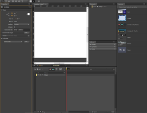
The Adobe Edge Animate workspace is quite cluttered – but you can customize it to better meet your needs. That’s exactly how we’ll start. First, close the Lessons panel. These will be useful later but, right now, we want as much real estate clear as possible. Next, we’re going to need the Properties panel, but we can undock that to make it less obtrusive. Click the menu in its top right corner, choose “Undock Panel” and then resize it once it’s floating free.
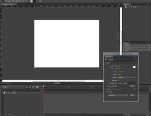
That’s better!
2. Create a Button
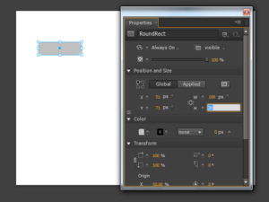
Now that we can see the Stage, we can build a button. There are three simple drawing tools a Rectangle, Rounded Rectangle and Ellipse tool. We’ll go old school and use the Rounded Rectangle to create our button.Draw a shape that’s 100 x 30 pixels. How do we get it that precise? When you’ve got the dimensions approximately right, you can click the “Link Width and Height” toggle in the Properties panel and enter the dimensions manually.
3. Create Animation
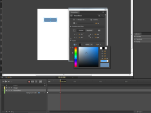
Our animation will be a simple proof of principle – a change of color. In Adobe Edge Animate, as in Flash, animation is created using “keyframes”. Firstly, turn off Auto-Transition mode by hitting “X”. You can see it toggle from green to grey in the timeline.
Next, we need to add a keyframe at the beginning of the sequence. To do this, select the rectangle you drew on the Stage and go to the Properties panel. In the “Color” section click the “Add Keyframe for Background Color” toggle. It’s a little grey diamond that turns orange when you activate it.
Now, move the Playback to 0.00.500 ticks and click the “Add Keyframe for Background Color” toggle again. This time, choose a new color for the rectangle.
4. Add Button States
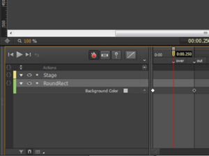
With this simple animation created, we need to add some labels and names so that we can program interactivity. No real coding will be required – it’s all menu driven.
Select the second keyframe in the timeline – the one at 0.00.500 – and hit CTRL + L (CMD + L on a Mac). This inserts a label. Give it the name “out”. Next, move the playback head to 0.00.250. Insert a label here too. This time, give the label the name “over”.
5. Attach Interactivity
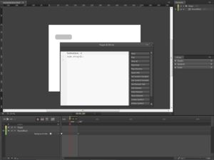
Now for the programming. We need to do four things to make this two stage animation work as a button.
Firstly, we add a “trigger” on the timeline. This is a timeline point where an action occurs. Move the playback head to the “over” label and hit CTRL + T (CMD + T on a Mac). Two things happen. The Actions window pops up and a trigger icon is inserted in the actions layer of the timeline. Click “Stop”. This adds a simple snippet of code that stops the playback head when it reaches this part of the timeline.
Next we add animation behavior to the button itself. Right-Click (or CTRL-Click on a Mac) to open up the button’s Action window. Click the “Add” icon and choose “MouseOut”. Click the button “Play Reverse”. Type the label name “out” between the parentheses. You’ve created a snippet of code that should look like this:
sym.playReverse(“out”);
This bit of code tells the animation where to go when the user’s mouse cursor is outside the button.The final bit of code goes on the “MouseOver” event. With the Actions window still open, click the “Add” button and choose “MouseOver”. Click the “Play” button and this time type the label name “over” between the parentheses. The line of code should look like this:
sym.play(“over”);
This tells the button what to do when the user mouses over it. All done.
6. Test the File
Go to “File > Preview in Browser” to see the animation working. Now you can add further interactivity to the button. The easiest action is to use a “click” event to open up a URL.
Now you’ve got the basics down, you can gussy that button up a bit. Try some drop shadows or bevels or whatever it is the cool kids are doing nowadays. You can even use bitmap files on each keyframe instead of vector shapes. This is your first step on the road to creating interactive HTML5 content with Edge Animate. You’re on your way to making your content sparkle and “pop” just a little bit more.
Image by FlickrGet better at your job right now.
Read our monthly newsletter to master content marketing. It’s made for marketers, creators, and everyone in between.


