Brands
How iTunes Keeps the Beat Jumping on Facebook
This post is part of the Killer Facebook Pages Series, which highlights the top brand pages on Facebook and provides tips on how to emulate their successes.
 In the eternal war of the giant tech brands, Facebook and Apple may not always see eye to eye. But the two monoliths find ways to capitalize on each other’s platforms; Facebook, through its mobile app for iPhone, and Apple, through an impressively prolific use of Facebook brand pages.
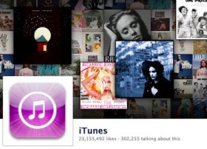
At the forefront of Apple’s Facebook presence is its page for iTunes. With over 23 million fans, the multimedia store software is number 12 on the top 15 most popular brands on Facebook, sandwiched between Sony PlayStation and Skittles.
The only other music brand to crack the top 20 is MTV, which, one could argue, is not so much about music as it is about other types of programming (see: The Jersey Shore).
 iTunes presences for other countries, e.g. Canada, Germany, and “Nordics,” as Apple calls Scandinavia, each get their own pages. Yet, somewhat surprisingly, Facebook shows that Bangkok, Thailand, is the city with the most iTunes page fans. Less surprisingly, the most strongly represented age demographic is 18-24.
Like all things Apple, the iTunes page is design-oriented, at least as design-oriented as a page can be within the rigid constraints of Facebook’s Timeline format. Still, Apple finds a way to make their ethos of appealing, clean visuals shine through.
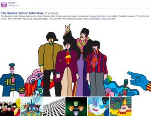
For instance, a recent post highlights the Beatles’ Yellow Submarine movie, complete with a mini-album of four psychedelic illustrations.
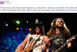
It also relies heavily on the landscape image functionality available on Timeline, posting wide, editorial-quality photos of recognizable artists both past and present: an artistic portrait of chart-topping Gotye; a vivid action shot of famed guitarist Slash.
 But while the content is visually engaging, calls to action are a bit less memorable; perhaps a symptom of the general risk aversion of large multinational brands. Polls prompt users to answer questions like “What’s your favorite hit on the latest Now That’s What I Call Music album?” and open questions to fans seem safe — see “What does Memorial Day mean to you?”
Additionally, because iTunes multimedia must be purchased within the iTunes interface itself, clicks on page content lead directly to a browser request to open the program. It’s a user experience that was intuitive when iTunes was far and away the primary software for music listening, but in today’s world of streaming, it’s an added step.
Driving fans to iTunes is a logical step, but leaving Facebook not for another website but for a desktop app seems unusual.
What the page lacks in actionable items, though, it makes up for in static content. In addition to using Timeline to share photos, iTunes’ timeline is also peppered with milestones in the most traditional sense of the word.
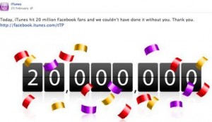
 A screenshot of an older version of iTunes accompanies a post regarding a milestone from 2003: the day that iTunes launched. Later on, the milestones become more self-referential; custom art celebrates the 20,000,000th fan — a feat that was accomplished in February, which means that in the past few months iTunes has accrued another couple million likes.
Despite the dual constraints of a staunchly controlled platform — Facebook — and a tightly monitored brand — Apple — the iTunes Facebook page finds a way to bring a bit of the unexpected to its page, whether through custom creative designed with Apple sensibility, or on the other extreme, the occasional Elvis fan photo.
It goes to show that a little creativity on the part of established brands can go a long way.
Get better at your job right now.
Read our monthly newsletter to master content marketing. It’s made for marketers, creators, and everyone in between.


