Brands
Booze + Arguments = America (= Shareability)
The Wikipedia entry for German liquor brand Jägermeister is full of all kinds of hysterically straightforward gems, like “Jägermeister does not contain any deer or elk blood,” and “A shot glass of Jägermeister dropped into a glass of Red Bull energy drink makes a cocktail called a Jägerbomb.” There is also a picture of Vanilla Ice pouring Jägermeister down someone’s throat.
But nowhere in this Wikipedia entry does it say anything about Jägermeister having anything to do with the state of New Jersey. And this confused me, because all over the internet today people have been distributing an image created by men’s lifestyle brand Thrillist, called “Red, White, and Booze: Mapping All 50 States’ Most Iconic Beer/Hooch,” a U.S. map in which each state is replaced by the logo of that state’s most famous beer or liquor brand.
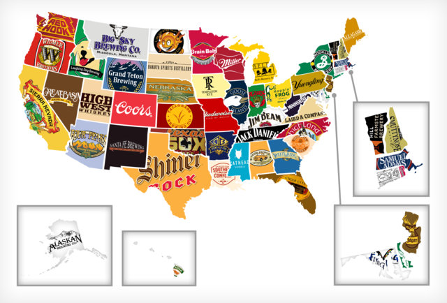
Thrillist’s “Red, White, and Booze” map.
For Kentucky, it’s Jim Beam; for California, it’s Sierra Nevada; and for New Jersey, a state where I lived for 15 years, it’s Jägermeister. Which I simply did not understand. According to the aforementioned delightful Wikipedia entry, Jägermeister indeed has no connection to the state of New Jersey, and, per the responses to a cranky Twitter post that I shot out into the digital ether, its only connection to the state is a frequent name-dropping by the guidos of reality show “Jersey Shore.”
(Worse, a true Jersey liquor success story — Laird & Co., the oldest licensed distillery in the country and the makers of Laird’s famed applejack — was attributed on the map to Virginia. Virginia.)
But I digress. The point is, my indignation over this map caused me to share it on Twitter. And comment on the original map. And that’s exactly what Thrillist, a company that’s shown continual savviness over the years with regard to brand-generated content that people will actually share, was hoping would happen.
The secret sauce (secret whiskey?) here is that there is just about no kind of content that will spur people to share it online more than content that somehow generalizes them. If they like it, they’ll shout out in solidarity (“Hell, yeah! Allagash!”) but they’re even more likely to share and comment and keep perpetuating the content if they’re dissatisfied. They’re compelled to talk about themselves, prove their own authority, and get into a verbal sparring match that makes them feel like they’re part of something that’s worth representing.
“Red, White, and Booze” is the latest in a series of U.S. map graphics that have been increasingly popping up on the likes of BuzzFeed, Tumblr, Reddit, and other hubs of easily digestible, easily shareable content. Thrillist is one of the first times it’s been turned into a brand play rather than something purely editorial (e.g. accompanying a bigger magazine article), or the domain of a lone Tumblr user with a copy of Photoshop and some time to kill. But it certainly won’t be the last; these maps of logos, facts, and random stereotypes are quick to gain the digital momentum that brands crave, even as the idea of an “infographic” threatens to become so overexposed that it elicits eyerolls instead of clicks.
these maps of logos, facts, and random stereotypes are quick to gain the digital momentum that brands crave
“Red, White, and Booze,” for one, now has over 5,000 ‘likes’ on Facebook and nearly 200 comments at the time of this writing, barely 24 hours since it was originally posted. Why? Because there are few things more American than bickering over our minor but oh-so-crucial regional differences. And these maps are the equivalent of waving a carrot in front of a horse, or perhaps a better analogy would be waving a Yankees pennant around in a bar full of Red Sox fans.
Thrillist says “Red, White, and Booze” was inspired by a recent map created by artist Steve Lovelace, called “The Corporate States of America,” which fills in each state with the logo of what Lovelace deems to be its most iconic brand (Lovelace’s blog post has over 250 comments). GOOD magazine polled its readers for a similar map to determine the best beer brewed in each state, which was particularly amusing because no respondents could seem to think of a good beer brewed in Idaho. And a Reddit user generated heated online arguments with a map that claimed to select the most iconic movie that takes place in or represents each state (“Fast Times At Ridgemont High” beating out a dozen lovely midcentury Hollywood-themed noirs to take the California title? Really? Oh, wait, it’s Reddit.)
Even when it’s disseminating factual content rather than the opinion of the creator, presenting content in this kind of state-by-state graphical breakdown still catalyzes quips, debate, criticism, and shareability — Deadspin used it to map the highest-paid state employees, who are typically football or basketball coaches with a few oddball exceptions (in Nevada, it’s a plastic surgeon employed by UNLV’s med school, of course), and racked up over 500 comments. Psychology Today magazine, not exactly a top name when it comes to viral content, created a widely shared state-by-state map of the most common places for Craigslist’s “missed connections” ads to be posted — it’s mostly “bar,” “supermarket,” or “Walmart,” but in New York it’s “subway,” in California it’s “24 Hour Fitness,” and in Indiana it’s “at home,” making you wonder just what kind of habit Hoosiers have of peeking into each others’ windows.
The reason why the “state map” phenomenon works so well in terms of viral potential is that while it’s rooted in stereotyping one state from the next, it’s generally inoffensive. It’s tapping into the same kind of heated but ultimately friendly rivalries that happen between sports teams, universities, and Star Wars vs. Star Trek fans — there are rarely ugly implications of racial, ethnic, or political stereotypes.
The content can’t be outright wrong, but it can (and should) be controversial. That’s easy because state lines are regularly silly and arbitrary — consider just how little in common Miami has with Pensacola, that northern and southern Virginia are worlds apart, or how many Austin residents feel the need to tell out-of-staters that their city is totally different from the rest of Texas — but our home states are on our driver’s licenses and our income tax returns, and we often, light-heartedly, have to own up to both their best and worst qualities.
It’s tapping into the same kind of heated but ultimately friendly rivalries that happen between sports teams, universities, and Star Wars vs. Star Trek fans — there are rarely ugly implications of racial, ethnic, or political stereotypes.
Few things hit the mark better in terms of content that people will not just share, but keep on sharing: They don’t just think it’s attractive, or informative, but it’s something on which they want to comment, and they want to be heard. It’s not as simple as that for every brand — for Thrillist, booze and neo-Americana are incredibly on-brand, so they have it pretty easy. But it’s a reminder of just how simple the basics are behind internet sharing successes that people (and advertisers) tend to overthink by several orders of magnitude.
And, on a related note, it’s probably about the right time for meme-hungry brands to jump on the “map graphic” craze sooner rather than later, before it’s as out-of-steam as those “Keep Calm & Carry On” variations.
Or Grumpy Cat knockoffs. Please, make those go away.
Image by spirit of america / Shutterstock.comGet better at your job right now.
Read our monthly newsletter to master content marketing. It’s made for marketers, creators, and everyone in between.