Nonprofits Need to Rethink Their Infographic Addiction
A look at whether nonprofits are failing to make a lasting emotional connection to potential donors by relying on seemingly appealing presentations of colors and numbers.
Think way back to the days when you flipped through TV channels late at night and happened upon Sally Struthers carrying a poor, distended-bellied child, imploring you to donate just $1 a day. Flash forward to today when a Facebook friend shares a clean, crisp infographic filled with statistics about the numbers of starving children in the world, asking you to drop a few bucks to solve world hunger. Clearly, there’s more than the nostalgia for remote controls going on here.
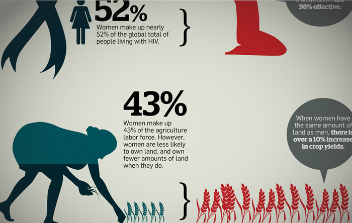
Data visualization is one of the most popular forms of content marketing right now, and it’s particularly exploded in the nonprofit world. Just take a look at this curated Pinterest board for a taste of the variety of graphics nonprofits are putting out. And there’s no denying that friendly sans-serif fonts and simplified icons representing world problems somehow make big, scary things like climate change and international poverty seem more manageable and that change really can happen. But why are nonprofits in particular so eager to jump on the infographic bandwagon? And at what expense are they doing this?
I’d argue that nonprofits are losing out on the right way to tell their stories — the ways which convert bystanders into active, repeat donors — by presenting so much of their marketing in infographic form. And, full disclosure here: I’m only coming to this realization after launching (what ended up being a successful) infographic-based campaign. I even wrote about it on this very blog.
But let’s tackle that first question: why infographics? After a flurry of scandals, there’s a bias in the nonprofit world toward accountability—specifically, being able to track every dollar spent, and demonstrate how it translates into social good. Combine that with the fact that potential donors have little time to absorb the intricacies of a problem, and it’s no surprise that nonprofit marketers have looked to infographics as the answer to their prayers; they’re easy to digest, capture lots of data, and help document returns on contributions. Plus, lots of organizations do them really well.
At this point, the issue sounds like it’s all rainbows and sunshine, so what’s the cost of relying on infographics? Well, there are two major downsides to simplification, both of which impact long-term engagements with repeat donors. First is emotional whitewashing.
Research into the psychology of imagery in charity communications has found that faces, particularly those exhibiting sad emotions, increase empathy in viewers. And in turn, empathy increases the likelihood of charitable donations. So let’s say you got around the whole faces thing by using photos instead of icons. You’re still risking a lot of emotional capital; infographics as they’re executed most of the time reduce problems to statistics—numbers and percentages that can’t possibly capture the profound impact on the real world.
When you’re banking on people feeling something (let’s face it, only a handful of people in this country have actual fiscal pressure to donate money — the rest of us do it because it matters to us to help others), you’re betting an awful lot on your audience’s ability to have a reaction more significant than “gee, that’s a lot of hungry people in the world.” Which brings me to the second problem with over-reliance on infographics: they actually skim over the steps your organization takes to solve a pressing problem. In brand speak, that would mean infographics downplay your competitive value. If you’re a nonprofit, there is likely at least one other nonprofit that has a similar mission to yours. The differentiating factor is often in how nonprofits go about accomplishing their missions, and this is what infographics frequently don’t show.
I’ll bet you’re thinking, “wait, I don’t get it, infographics let me demonstrate the scope of the problem and then how many people/trees/manatees I’ve touched.” And sure, that’s enough if you want a totally transactional relationship with your donors (they give, you do). But, as you’re likely tired of hearing me say, that kind of relationship doesn’t keep people coming back for repeat donations. Given the incredible amount of competition for share-of-wallet among charitable organizations, it’s integral that you demonstrate why your approach alleviates a social challenge, how your organization does the heavy lifting, and why that donor money is necessary. With infographics, the beginning (the problem) and end (the improved situation) of the story are told. The middle is often omitted entirely, and it’s those middle chapters of the nonprofit story that both differentiate it from the competition and provide that crucial emotional connection that will mean a donor is more likely to come back.
Giving people enough data to get them interested, but couched in the value you add—without sounding like an annoying sales person—is no easy task. On the spectrum of sad, hungry-looking babies to pie charts, are infographics getting us closer to a form of content that is authentic, informative and compelling? Yes. But they aren’t a “silver bullet” to courting repeat donors, and nonprofits are relying on them too much. Data, when presented well, can tell a story — but it frequently isn’t the full story, and the parts that are most frequently omitted are the parts that are the most crucial for a nonprofit in search of donors. Triggering that emotional connection requires looking beyond the numbers.
Anna Sternoff
Anna Sternoff leads the Creative Strategy team at <a href="http://www.captainsofindustry.com/]">Captains of Industry</a> and sits on the board of directors for the NGO <a href="http://www.empowergeneration.org/">Empower Generation</a>.