Content Marketing
5 Steps to Creating Killer Infographics
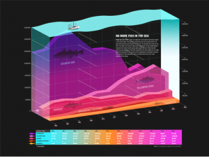
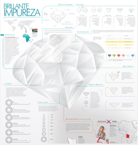
Want to create easily shareable content that boosts page views and backlinks? Consider infographics (or data visualizations), which get 30 times the page views of a comparable article, according to Lee Sherman, co-founder and chief content officer of Visual.ly, an online community for sharing and promoting infographics.
Sherman describes these data visualizations as “the perfect medium for consuming information because they allow you to tell a story in a very compact way that is easily shareable.” They can also lend themselves to short attention spans and readers’ growing obsession with tablets.
Here’s how brands and businesses can use infographics to create irresistible, shareable content and compete editorially with traditional media.
Look at the Data You Have
While Sherman says traditional media outlets still have an edge over brands using content marketing, one advantage of brands is that they already have a wealth of interesting and valuable data that can be turned into infographics. Sherman points to companies like OKCupid.com, Mint.com (where Sherman previously worked as editor and this writer has previously contributed), and AirBnB.com, which “are figuring out that they can market through data that then can be picked up through traditional media organizations.”
Follow the Rules of Traditional Journalism
One area where some infographics fall flat is through improper sourcing or inaccurate representation of data. “It’s very easy to lie with data,” says Sherman. “There are countless examples of bad infographics, where, for example, the size of elements on the page are not proportional so they distort the message.” Data should also be carefully fact-checked and attributed to the original source. As Sherman adds, “really, there should be no difference between a story in The New York Times and a properly done infographic.”
Tell a Story
It’s not enough to throw together a bunch of interesting stats on a related topic. The data and graphics need to work together to tell a coherent story. For instance, Stateline, a nonprofit news service, published an infographic showing how the National Guard has evolved since 9/11, including a graph of the number of deployments and the number of National Guards killed in action by state. Another infographic published by mobile application development company [x]cubeLABS offers a timeline on the rise of Android.
Mix it up
Infographics covering timely topics like the Royal Wedding or Steve Jobs’ resignation may spread quickly in a short time period, but they also face intense competition and risk seeming rushed. Sherman notes that some brands moved quickly to capitalize on the news about Steve Jobs, creating a flurry of hastily assembled (and in some cases, tasteless) infographics. “News is great if you can do it well, but you’re going to be competing with everybody else,” he explains. “Sometimes you’re better off taking a little bit more time and doing something with a deeper level of analysis.” Infographics based on evergreen topics like how a hurricane starts or how to buy a TV can boost SEO and generate backlinks over a longer period of time. “If you can do the definitive guide and create a useful resource, those sorts of things have legs and are going to get linked to a lot,” he adds.
Include a Strong Takeaway
Sherman says the best infographics not only tell a story but offer a strong takeaway. For instance, Wasp Barcode Technologies published an inforgraphic that offers tips on SEO for small business, and FreeBackgroundChecksUSA published one that combines the history of AirBnB with actionable tips on how to protect your home while renting it out through AirBnB.
Has your business started marketing through infographics? Have you seen other infographics worth sharing?
Related articles
- How to create a great infographic (thecontentlab.icrossing.com)
- How Marketers Can Get More From Infographics (mashable.com)
Get better at your job right now.
Read our monthly newsletter to master content marketing. It’s made for marketers, creators, and everyone in between.


