Strategy
How We Doubled Webinar Leads By Becoming Our Own Biggest Advertiser
The year is 1994, and people are excited about—checks notes—banner ads. No, seriously. The internet was new at the time, and the media and marketing industries expected websites to be a utopia for advertising.
“We came with the attitude that this was a sacred ground,” Joe McCambley, who helped create one of the first banner ads, told Fast Company. “The rest of advertising had been ruined and dammit, we weren’t going to let that happen this time.”
If only.
Depending on your study of choice, click-through rates clock in around 0.2 percent for banner ads these days—and most of those clicks are accidental. They’ve become digital mosquitos hovering over the sacred ground—painfully annoying things that follow you around wherever you go.
But what if we were thinking about them the wrong way? Contently’s marketing team recently placed some banners on our site as an experiment, and they actually worked. In this case, however, we made one important tweak that might seem counterintuitive: We used the space to promote ourselves.
Making some changes
Every month or so, we host a webinar. We set a date, schedule a few announcement emails leading up to it, and a bunch of people register. Along the way, we also mix in social posts on Facebook, Twitter, and LinkedIn that link to the registration page and dedicate a spot to it in our weekly newsletter.
For years, that encapsulated our promotion strategy, which meant webinar leads were both predictable (which is good) and flat (not as good). We came to expect around 600-700 leads per presentation, give or take a few depending on the topic.
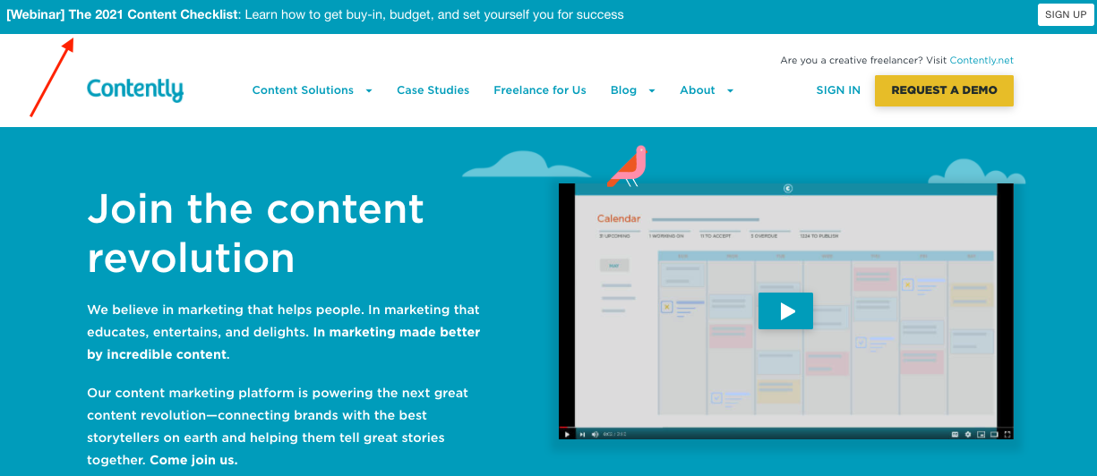
In 2019, we decided to add a thin banner to the top of our homepage to promote upcoming resources and webinars. No image, just one line of text and a call-to-action button.

Our aim was to fit the design in with the rest of the site. We hoped it would be a tasteful alternative to the chunky ads that take over the top of most media sites. Sure enough, e-book downloads increased and webinar registrations gradually started to jump to 700-800 on average. All without needing to do any extra outreach over email or other channels.
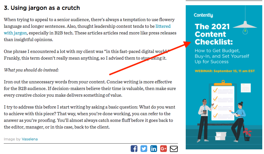
Next up, we decided to put the same banner on our blog homepage and test out a vertical banner on the right rail of our individual article pages. The potential here was huge because most TCS readers come directly from search or email. We went with a more traditional style on the vertical banners so we could add a visual element.

The move generated immediate returns. Our latest effort, The 2021 Content Checklist, brought in 1,276 registrants, and became our most popular webinar to date. Here’s a breakdown of registrants by source:
That’s 630 leads from the banner ads on the homepage and blog, or 49.4 percent of the total. Not bad for promoting a webinar that covers complex marketing issues.
Rethinking your website real estate
Truthfully, we didn’t expect to double our webinar audience with a few tweaks. Aren’t people supposed to be blind to the spots designated for banner ads around the web?
The answer really depends on the content.
In 2018, the Nielsen Norman Group ran an eyetracking study to see exactly where people looked on the page when encountering ads. Unsurprisingly, users ignored all the typical ad placements on the top and sides of pages.
However, brands have an opportunity to rethink all the available space on their sites. On The Content Strategist, our audience comes to us for content marketing expertise, and they’ve never seen ads for other outlets on our site, so the banners probably caught their attention in a good way.
It’s a tactic I’d strongly recommend, especially if you have a trusted blog or resource center. By putting owned content and relevant links there, you can significantly increase website conversions and, in some cases, direct revenue.
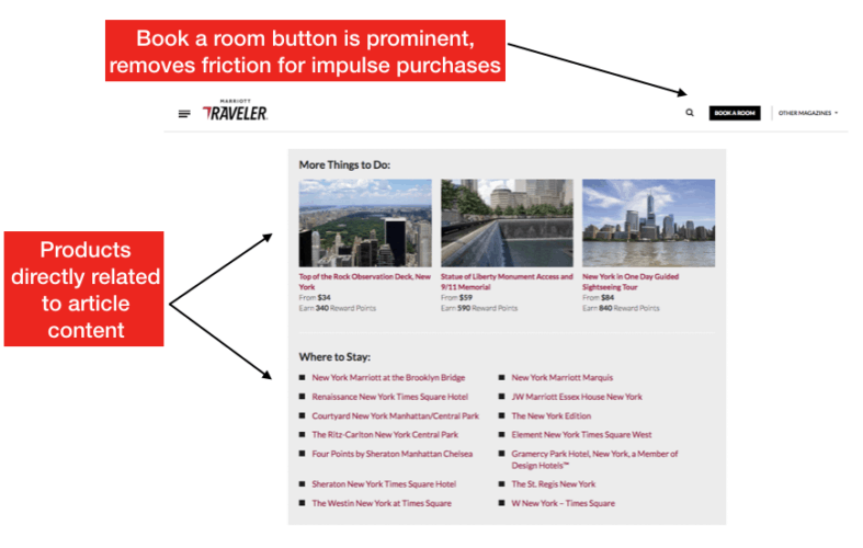
Take Marriott, one of our clients, which uses this approach on its Marriott Bonvoy Traveler magazine. Traveler covers 87 destinations around the world, and each section blends local tips with in-depth features and profiles. Marriott doesn’t plug itself in the content, which could turn off potential customers. Instead, the company recommends where to stay and what to do in the spots typically reserved for ads.

As our head of marketing Joe Lazauskas put it: “Once you finish reading, Traveler makes it very easy to book a room or a Marriott Rewards experience with a module at the bottom of the page. Marriott essentially acts as the advertiser of its own high-quality editorial content.”
The strategy made an immediate impact as Marriott’s content led directly to millions of dollars in new bookings.
It’s a good reminder that you should aim to make it as easy as possible for people to convert on your site. For marketers wondering how to drive more leads from their ungated content, this is one easy way to do it.
Banner ads may have hurt marketing in the past, but there’s still time for us to clean up the sacred ground online and benefit in the future.
Image by Bad BrotherGet better at your job right now.
Read our monthly newsletter to master content marketing. It’s made for marketers, creators, and everyone in between.


