Storytelling
Why Infographics and Other Visual Content Are Saving Lives From COVID-19
For decades, Karl Gude has delivered timely visual content to the public. As the former director of information graphics for Newsweek and the Associated Press, he collaborated with writers, researchers, and graphic designers to cover everything from Columbine and 9/11 to the AIDS crisis and stem cell developments. So when the United Nations put out a call for creatives to help stop the spread of COVID-19, Gude sprung into action.
He created “Breaking the Chain of Infection,” designed with the help of Carol Navarro, a registered nurse, and spoke with multiple doctors to vet the information. To maximize impact across the globe, the infographic was translated in Arabic, Chinese, French, German, Italian, Japanese, Korean, Malayalam, Portuguese, and Spanish.
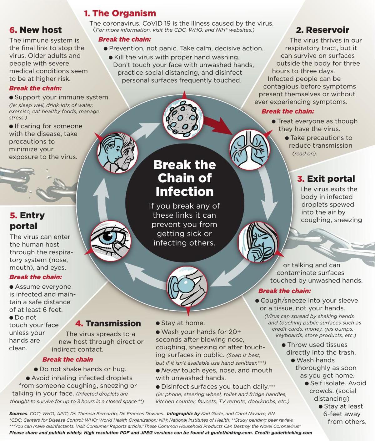
You may not have seen Gude’s infographic before now, but you’ve definitely seen story after story about COVID-19 over the last few months. Turn the television to your preferred news outlet, stream a press briefing, read the latest article online, and you’re likely to be bombarded with an overwhelming amount of facts, figures, statistics, scientific data, and medical advice sprawled across the screen.
When done right, infographics and other types of visual content can be an antidote of sorts during the news cycle. There are many different types of visuals proving successful in relaying important content to audiences: infographics, data visualizations, charts, maps, cartoons, animations, illustrations, simulations, even GIFs.
Best of all, they simplify complex details and give learners a chance to process a lot of information.
More than just eye candy
Today, we’re seeing the most reputable sources relying on visuals to spread their messages—The Center for Disease Control, the World Health Organization, local hospitals, city municipalities. These visuals aren’t just eye-catching, but studies have shown that they actually increase the audience’s ability to retain important information.
“Editors have always said that graphics make great entry points for stories,” Gude said. “They’re great at attracting interest to more information about that topic.”
According to Wiley Education Services, it takes far less time to process symbols than text alone. “In fractions of a second, the brain can process symbols and attach meaning to them (Thorpe, Fize, & Marlot, 1996). Because infographics associate concepts and ideas with iconography, they naturally tap into this processing power and can help students engage more deeply with your content.”
Hundreds of studies and experiments have shown that pairing visuals with text helps people comprehend and remember information more effectively than just reading or listening. The brain processes visuals 60,000 times faster than text, and a lit review published in Educational Technology Research and Development found that including illustrations with text instructions helps people perform a task 323 percent better than those who read the instructions without visuals.
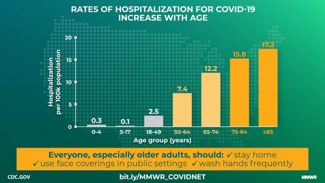
“The human brain evolved to be sort of like a visual processing machine,” said Alberto Cairo, Knight Chair in Visual Journalism at University of Miami and director of the visualization program of the Center for Computational Science. “A huge part of our brain is devoted to processing information that is gathered through our eyes.”
Cairo cited a Washington Post story from March about why outbreaks spread exponentially, which is full of interactive graphics and quickly became one of the site’s most popular stories of the year. “It’s a model of how an epidemic changes and expands. That visual simulation [was] the most viewed story…. That says something about the popularity of these images.”
Digging through the data
As the senior program manager for the 21st Century Cities Initiative at Johns Hopkins University, Mac McComas works with large data sets every day. Some of that big data gathered from public sets, or through various data use agreements, ends up being displayed through visuals.
“A lot of the research we do is on everything from housing, economic development issues, transportation, small business development, education and health outcomes—and how public policy and the private sector shape that,” McComas said.
Naturally, that research turned to COVID-19, specifically observational analysis of trends in Baltimore.
The 21st Century Cities Initiative has started by comparing data points from the first four months of 2020 to the same time period in 2019. The goal is to examine how COVID became a “shock to the city,” as McComas put it. That means examining behaviors like how often people go to grocery stores, purchase plane tickets, and even commit violent crimes.
“Visuals serve as a great entryway to get people thinking about some of these deeper research questions, but they’re never intended as the end point,” McComas said. “We always hope that they generate discussion and get people to think.”
That’s a key point stressed by everyone I interview. In a hurried society, audiences are spending less and less time with your message. Understanding the limitations of that can be helpful when communicating through a visual medium.
“Really try to do some detective work, and make sure you’re understanding the full limitations of what the graph or visual is actually saying,” McComas said.
In some cases, that abstraction can get away from the creator. Take this tornado of a graphic posted by an Oxford professor, which was later mentioned in a Financial Times article titled “When data viz goes psychotic.”
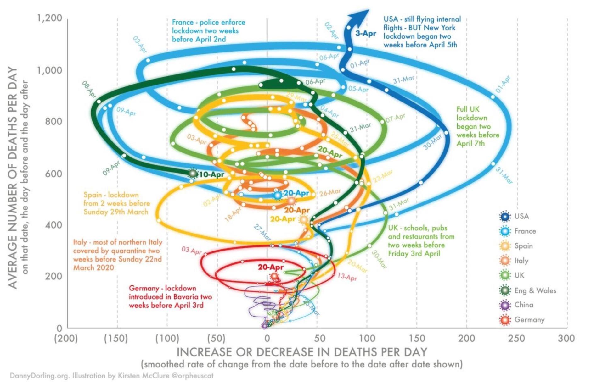
Not exactly easy to read. In other COVID-19 coverage, I’ve seen charts are comparing the number of virus deaths in April 2019 to April 2020, which obviously isn’t the whole story.
“The challenge is not just to show the numbers to people…. but it is important to add, what we call the annotation layer,” Cairo said. “The annotation layer is the words (either written or spoken) that you put on top of your charts to emphasize, explain, and highlight what they mean, why they matter, [and] what it is they are measuring.”
Creating credible infographics
Making appealing and trustworthy infographics doesn’t require an art degree, but understanding basic design concepts is key.
“Designing with the end-user in mind informs your graphic, and focuses your research,” Gude said, of his eight-step process for making infographics.
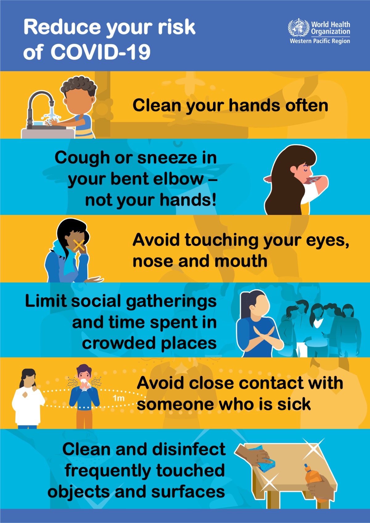
For example, handwashing graphics for children might use bright colors and cartoon illustrations. Graphics showing the scientific effectiveness of handwashing in healthcare facilities might provide more detailed instructions, stats, and text.
As far as getting started, there are some free or freemium options like Canva, Visme, and Infogram worth checking out. (Canva touts itself as the “non-designer’s secret weapon.”) 
In addition to knowing your audience, another important step is minimizing the amount of info you include. Not all of your extensive research has a home in that particular graphic. Many artists make the mistake of drawing visuals first before they have all pertinent information, which is working backwards.
No matter what type of visual content you decide to use for your message, one thing is for certain: Infographics and other data visualizations are excellent tools in delivering information. In the midst of a global pandemic, media outlets of all kinds have learned on visual content to reach the public with vital information. It’s not an exaggeration to say they’re saving lives as we deal with COVID-19.
As a final piece of advice, Gude always returns to a helpful quotation from painter Hans Hoffman when encouraging new infographic creators: “Eliminate the unnecessary so the necessary can speak.”
Image by Diane555Get better at your job right now.
Read our monthly newsletter to master content marketing. It’s made for marketers, creators, and everyone in between.


