ROI
Here’s Why Infographics Outperform Blog Posts
For months, my health-nut brother has encouraged me to develop a meal plan. (“Dumplings are not a food group, Erin.”) To humor him, I decided to map out what I would eat.
Suddenly, my menu was no longer determined by drunken noodle cravings. I started to classify food by value. I organized components into categories—protein, fats, grains, and vitamins—that would provide enough nutrition and energy to help me through the day. I hated to admit it, but after two weeks, I felt pretty damn good. My brother was right.
In many ways, developing a content plan mimics this same process. You don’t want to produce content that only superficially fills your audience. You also don’t want to offer them the same thing for every meal. In order to truly satisfy your audience, you have to serve a variety of stories in diverse formats on different channels.
To guide our customers (and ourselves) in this process, Contently’s data scientists tracked the behavior of our clients’ content over the last year. Here’s what they found.
Blog post fatigue
Many brands currently invest in content, but most tend to fixate on one format: the blog post. Over the past year, more than 60 percent of Contently clients were exclusively producing blog posts, which is an unhealthy figure.
Sure, articles let brands talk directly to customers about solving problems, like how to save for a home while paying off student loans, for example. Blog posts have relatively low overhead compared to, say, a national ad campaign or video product release, and in some industries such as finance, they are necessary to edge out competitors trying to capture the same audience. But a content plan with only blog posts is like a diet that consists solely of bananas. Sure they provide some value and it’s safe to eat one per day, but without diversity you’re going to become malnourished.
The problem for many brands is they don’t have the data to justify alternative approaches that may cost more than a 600-word article.
When our data scientists examined 3,200 stories produced on the Contently platform over the last year, they found that a different type of content outperforms blog posts across most industries:
- Infographics reach 54 percent more readers than blog posts.
- The median cost to reach one reader for an infographic was $0.04 versus $1.77 for a blog post.
- Infographics have a 73 percent completion rate. Blog posts have a 66 percent completion rate.
HubSpot tells us that colored visuals increase people’s willingness to read a piece of content by up to 80 percent, and the Nielsen Norman Group asserts infographics help people retain more information than a typical article. These Contently statistics also show content programs with infographics have a clear advantage in both audience growth and engagement.
While infographics might—depending on the amount of design involved—cost more to produce upfront, when you factor in their reach, there is significantly more value per reader compared to a blog post.
The dark side of infographic distribution
The next question is, if infographics are shared more and have higher engagement rates than articles, where are readers coming from?
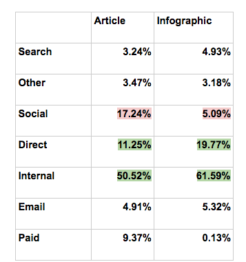
This chart from our data team slices the channels that drove both article and infographic traffic:

Since infographics reached more people than the blog posts, it would be natural to assume that this boost largely came from social, where infographics could serve as highly sharable visual content. As it turns out, Contently articles significantly outperformed infographics on social. Infographic traffic instead came from other “internal” sources—from another page on the company site—and from direct traffic.
The percentage of internal traffic suggests that readers are interested in infographics once they already know who you are. Perhaps people will come to your blog from an article shared on social, then click on an infographic that catches their eye once they’re on your site. It’s also important to point out that these readers aren’t just skimming and bouncing. They’re finishing infographics at a higher rate than blog posts.
While not many of our clients’ readers access infographics on social channels, they could still be sharing them directly with colleagues and friends. It’s impossible to fully know where this direct traffic comes from without setting more specific parameters, but chances are these readers were coming from “dark social“—which occurs when a URL gets shared in an email or chat. (Email traffic in the chart above refers to newsletters, not one-to-one correspondence.) The prevalence of chat applications like Slack and Google Chat has only increased dark sharing.
This type of communication, while harder to track, can still be beneficial. For example, users are much more likely to check out a link if it comes from a trusted source. And that direct communication doesn’t have to compete with jumbled social feeds. For these reasons, it’s crucial to not just consider the upfront cost of a piece of content, but how that content will provide value over time and across different channels.
Judging by the data, advocating for a content plan that includes infographics is not only going to make your website and marketing assets more visually appealing, but it will allow you to reach more people and have the budget to create more appetizing content for the long haul.
Image by Fotosearch / GettyGet better at your job right now.
Read our monthly newsletter to master content marketing. It’s made for marketers, creators, and everyone in between.


