Brands
5 Companies Creating Dynamic Content With Their Own Data
Plenty of publishers and brand publishers use data to create unique pieces of content—that’s nothing new. Often this data comes from outside sources: research firms, public institutions, big data companies, etc. But what about all the fascinating data you have within your own company?
Brands can now track and collect data to answer all sorts of questions, but most of the time these questions are directed internally: “How many people are using are service? How can we leverage our data to optimize our services boost our revenue?” But more often than not, there are other fascinating questions you can answer that’ll appeal to the larger public and help you create the kind of valuable—and perhaps most importantly, exclusive—content that separates you from the pack.
But gathering this kind of data is only the first step. The tricky part is figuring out how to pull out the meaningful stories lurking beneath the charts and numbers. Here are five brands that are showing the way to data nirvana.
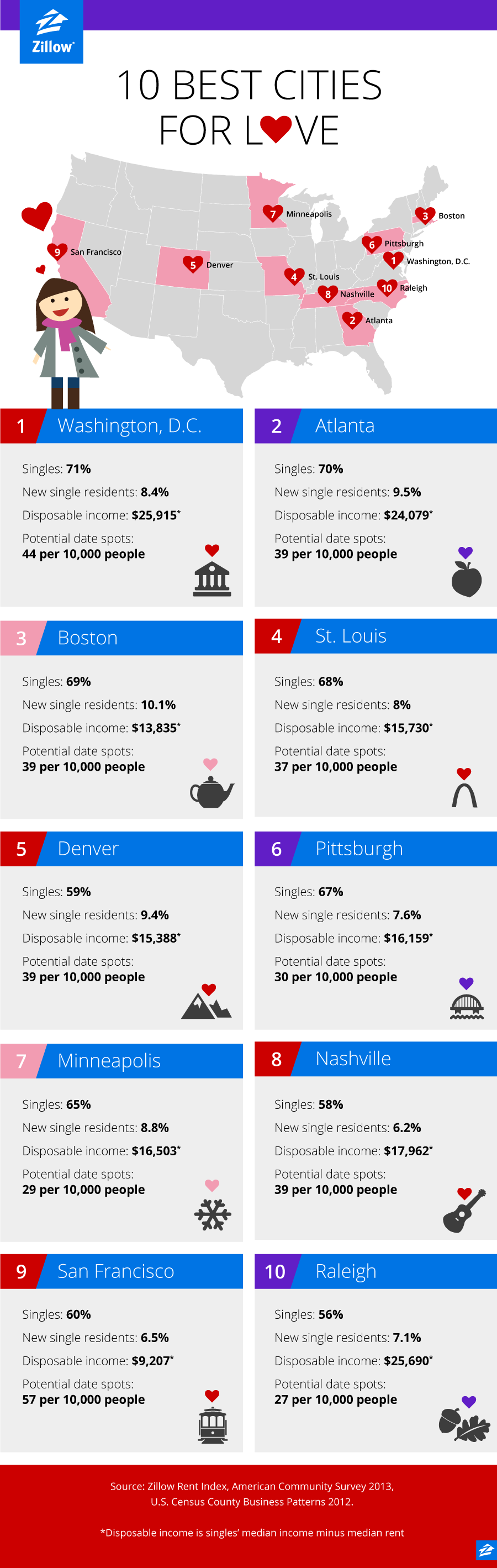
1. Zillow
With data on over 110 million homes in their database, Zillow has access to a lot of data on the real estate market. The information they gather includes a home’s value estimates, square footage, nearby amenities, and even aerial photographs. Though Zillow uses this data for their online marketplace, they’ve also started to repurpose it for creating original content.
While most of the data-driven posts take a conventional approach, such as their mortgage rate reports and pieces like “Where Can Millenials Afford to Buy Homes?,” Zillow is not afraid to find fun in their data. For instance, the piece “10 Best Cities For Love This Valentine’s Day” lists the best U.S. cities for finding a date based on each city’s percentage of singles, the median disposable income of those singles, and the number of date spots per capita. Another piece, “Best Cities for Black Friday Price Cuts,” ranked the top 10 cities with the biggest price cuts for homes.
Zillow also takes data-driven content a step further by publishing their own branded book, “Zillow Talk: The New Rules of Real Estate,” which debuted at number two on the New York Times bestseller list. The book takes a Freakonomics-like approach to real estate by sharing unexpected findings based on Zillow’s gathered data and original research.
Among these findings include the “Starbucks Effect,” which demonstrated that homes within a quarter-mile of a Starbucks increased in value, as well as the 15 keywords that help increase the selling price of a home. The New York Times also ran an excerpt from “Zillow Talk” as an opinion piece with an interactive infographic that helps users find out how their street name affects the value of their home.
2. Jawbone
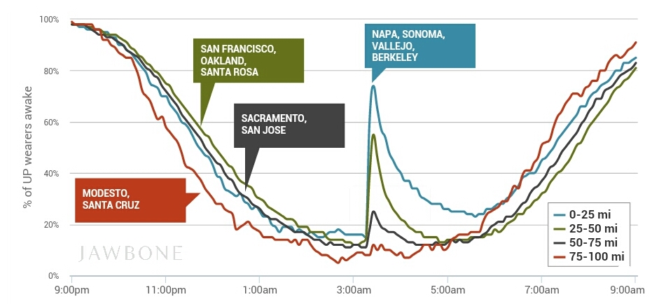
Jawbone is the company behind UP, a wearable tech product that helps users track their diet, movement, sleep, fitness, and other habits—all of which are done 24/7. Considering all the personal data Jawbone can data, it’s not surprising that their blog is filled with stories about user behavior, often told via interactive infographics.
Their most popular story so far is about how UP users in the Bay Area were affected by the South Napa Earthquake. According to the analysis from Jawbone’s data scientists, most UP users close to the epicenter woke up when the earthquake struck, and 45 percent of those who woke up stayed awake throughout the night. Another sleep-related story shows a whole year’s sleep disruptions among more than a million UP users in 11 countries. The study confirms what most of us know intuitively: Holidays, sports events, and Daylight Saving Time mess up our internal clocks.
But Jawbone’s best stories aren’t just about sleep: They also cover fitness and dietary topics, as seen in their posts about how people eat differently during Valentine’s Day and the Super Bowl, and which weight loss techniques are most effective for UP users.
With Jawbone’s data-driven stories, we’re not just seeing examples of good content marketing—we’re also learning surprising things about human behavior.
3. Litmus
Litmus is an email testing and analytics tool that helps users gain valuable insights on their email marketing campaigns, such as how many subscribers read an email vs. merely open it, which email tools subscribers use, and the email behaviors of individual subscribers.
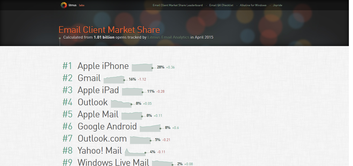
This March, Litmus released their 2015 State of Email report, which featured data on how email open rates changed across platforms and listed the top 10 email clients with the largest market share. Last year, in a joint effort with HubSpot, Litmus co-created a similar report on The Science of Email, which revealed email marketing trends and statistics from analyzing 800 million sent emails. That report has been shared over 2,400 times.

But Litmus doesn’t wait for yearly special reports to share their gathered data, which is often included in the tutorial posts on their blog when relevant. Litmus has also occasionally shared behind-the-scenes data on their company, including how well their own email marketing efforts worked in 2012, and their company-wide performance stats for 2013.
Since 2008, Litmus has been sharing regular email client market share reports, often posting updates on their blog every month. Now, a top five list is a permanent feature on their blog’s sidebar, and leads to a separate site that has a more detailed, interactive leaderboard.
4. Kaspersky Lab
Through a stunning interactive 3D globe, security software company Kaspersky Lab displays cyberthreats occurring in real time all over the world. The project, called the Cyberthreat Map, uses data from Kaspersky’s infrastructure to show users the prevalence of threats such as viruses, spam, and network intrusions. Users can even explore data from individual countries to see more detailed statistics and watch as cyberthreats are detected in real time. This game-like display gives users a chance to walk in the shoes of a cybersecurity expert for a few minutes.
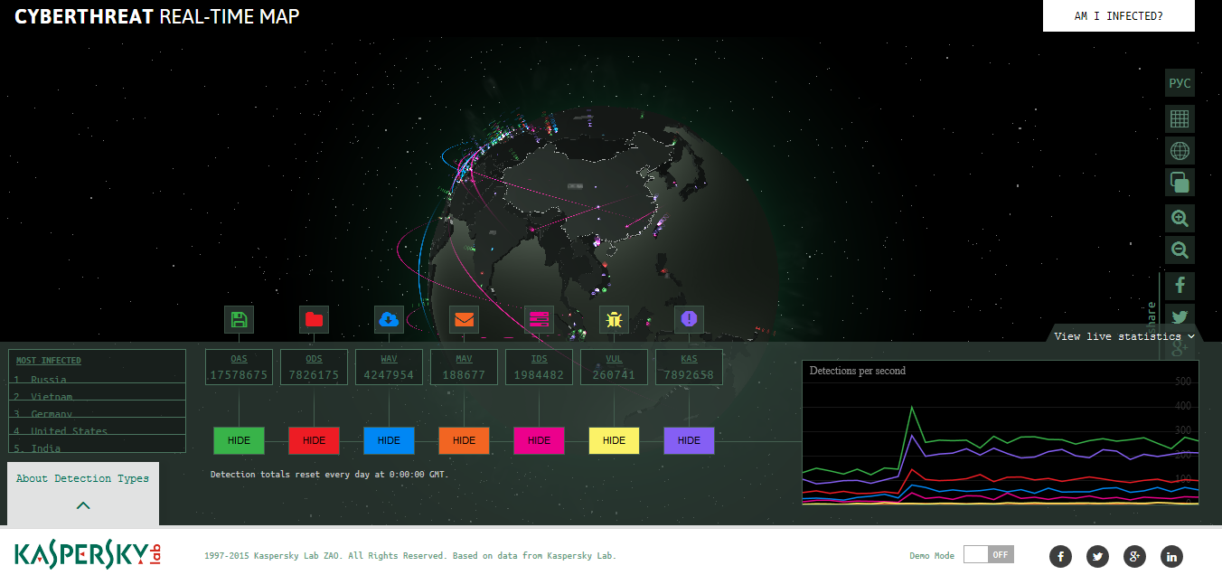
Two months after the Cyberthreat Map launched in April last year, it received a “Cutting Edge Project of the Week” award from Adobe and The FWA (Favourite Website Awards).
Despite its bells and whistles, the Cyberthreat Map is just a small part in Kaspersky Lab’s efforts to increase public awareness about cybersecurity. Their blog, Kaspersky Lab Daily, often features infographics and guides that include data gathered by the company. Kaspersky Lab’s real-time cybersecurity statistics dashboard, Cyberstat, has embeddable and shareable counters that display real time statistics about the number of cyber attacks, detected adware, hacked websites, and other security-related data.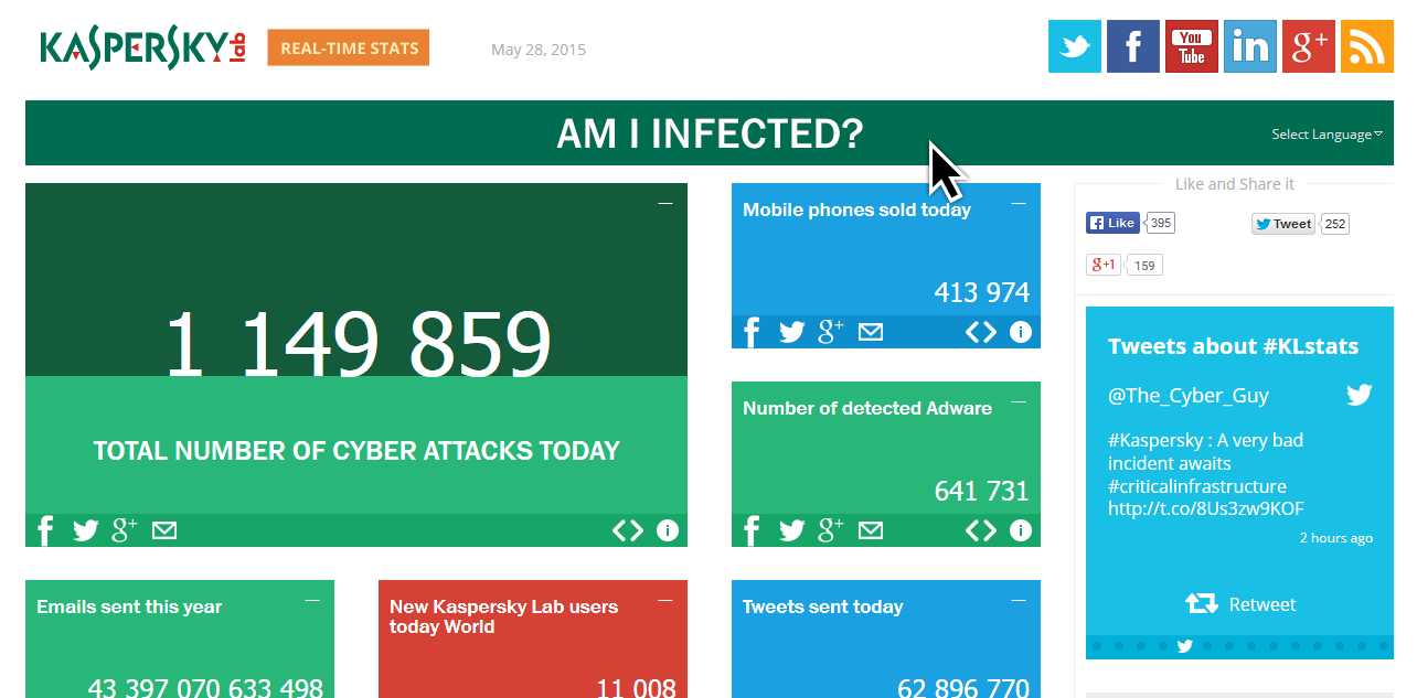
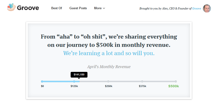
5. Groove
“Transparency blogging” is a thriving genre among startup blogs. Startups like Buffer, Slack, and Hubstaff post detailed metrics about their revenue, users, and marketing efforts. For this list, we’re focusing on Groove, a helpdesk software provider for businesses.
What makes Groove stand out is their take on transparency. Founder Alex Turnbull wrote in a recent blog post, “Transparency is a great tool that I’d recommend to anyone, but it’s not enough on its own.” In other words, it’s not the numbers and metrics per se that make transparency work—it’s about the value, insights, and stories that you bring to your readers.
In one example, Groove shares the many different metrics they use to track customer success and what their current numbers are for those metrics. This post doesn’t just reveal a list of conversion rates and churn rates, it also shares the decision-making process behind those metrics and the role they play in keeping customers happy and engaged. In another post, readers get a behind-the-scenes look at how Groove tested different pricing models—increasing their revenue by 25 percent as a result.
Despite these varied stories, there’s often a bigger story that Groove tries to tell with their metrics. Most recently, it’s the story of how they are going to reach their goal of earning $500,000 of monthly revenue. This means that even if you follow posts about different aspects of their business, there’s a primary narrative to return to.
The key takeaway that we can learn from Groove and the other “transparency bloggers” is that “Big Data” isn’t a must-have for telling compelling stories. Even your everyday metrics can make a difference as long as you’re providing something interesting and valuable for your audience.
As for bigger brands that have millions of data sets to draw their insights from, such as Zillow and Kaspersky Labst, the challenge is wading through all those numbers to find the few that would matter the most to your audience.
And it doesn’t hurt if the charts are pretty, too.
Image by DenphumiGet better at your job right now.
Read our monthly newsletter to master content marketing. It’s made for marketers, creators, and everyone in between.