Brands
5 World Cup Charts to Inspire Your Data Visualization Strategy
This post originally appeared on Visual.ly
The World Cup is arguably the biggest sporting event in the world, with soccer/football fans being the majority on every continent except North America and Antarctica. With so many eyes on the tournament, there are also a lot of visualizations for analyzing every part of the game, from the initial pairings right down to predicting the most likely winners. Even visualizations that show the same topic take different approaches. Let’s take a look at some of the most interesting out there:
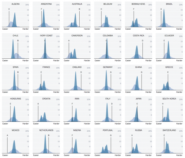
The New York Times focuses on the method for selecting the winners. Their interactive takes a look at the “fairness” of each initial group in the tournament. It produces pairings that on average are more “fair” and help keep strong teams that weren’t in the top eight from being destroyed early on by the big contenders. The interactive has two visualizations. The first looks at the current FIFA method for selecting a draw versus the Guyon method. The groupings are color coded for strong or weak. The second visualization uses small multiples to show the likelihood of each country to be grouped with teams that are harder or easier to beat. The piece does a good job of showing how earlier games would be more balanced, possibly increasing viewership and making each game more exciting.
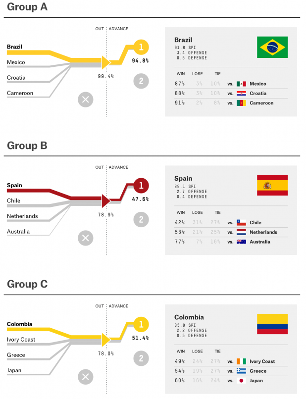
Nate Silver’s team at FiveThirtyEight takes their own approach, delving into the most likely winner of the tournament. They break the visualizations down into two sections, one for the group stage of the tournament and one for the knockout stage, which is more like a standard bracket. The group section uses Sankey Diagrams to show the likelihood of each team moving out of their groups and into the knockout phase. The knockout section uses a sorted heatmap to show the percent chance that each team will advance to the next stage, culminating with Brazil with a 45 percent chance of winning as things currently stand.
Andrew Yuan has also taken his own approach to predicting the winner of the World Cup. His project is more analytical and uses several visualizations in a dashboard view to show the chances of each country winning. He still places Brazil as the likely winner, currently with a 21 percent chance of winning compared to the next most likely, Spain, with a 7.6 percent chance.
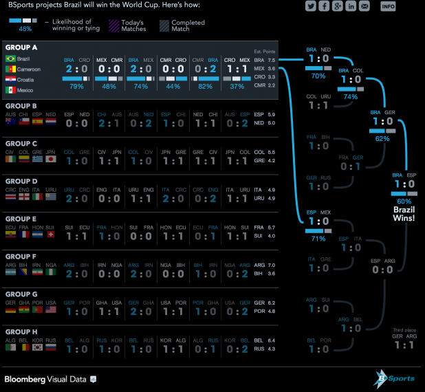
Bloomberg Sports takes the prediction angle as well and breaks the visualization down similarly to FiveThirtyEight. The group phase is shown using stacked bar charts, while the knockout phase is shown using a more traditional bracket view, still with stacked bar charts showing percentage chances. This is a nice approach because it shows data consistently and uses the structure of the tournament to help build the visualizations.
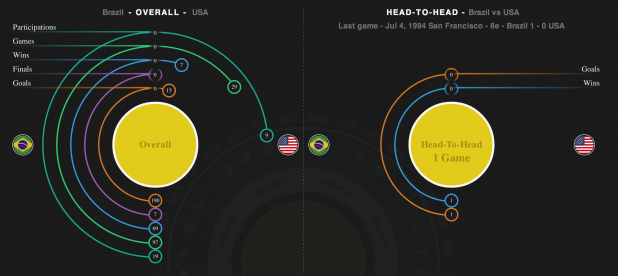
Yahoo Sports takes a completely different approach, looking at many of the factors that go into the World Cup. They examine football clubs and leagues, and their contribution to the World Cup teams in the past. They also look at the individual player level with their analysis of the players awarded the Ballon d’Or. The app also lets you compare individual teams’ overall performance against their head to head performance for the history of the World Cup.
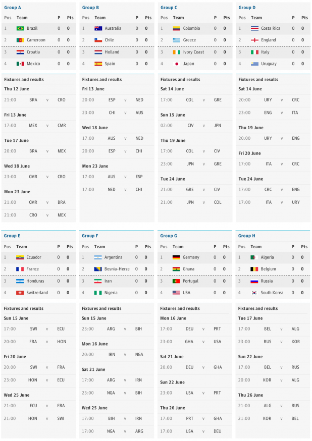
The Guardian takes the simplest approach of all, with a very basic table and bracket for the two stages of the tournament. The app is updated in real-time, and although it doesn’t really use visualizations, it is a great source for checking out the current status of each team in the World Cup.
All of these tools are great ways to take a look at the World Cup through a data-based lens. They all give us views of different parts of the tournament, and are great tools for analyzing and predicting which team will come out as winners.
Drew Skau is Visualization Architect at Visually and a Ph.D. Computer Science Visualization student at UNCC with an undergraduate degree in Architecture. You can follow him on Twitter @SeeingStructure.
What’s the deal with The Content Strategist? At Contently, storytelling is the only marketing we do, and it works wonders. It could for you, too. Learn more.
Image by footballwallpaper.orgGet better at your job right now.
Read our monthly newsletter to master content marketing. It’s made for marketers, creators, and everyone in between.

