Ask a Content Strategist: Why Are Brand Blogs So Ugly and Outdated?
Which comes first, content or design?
Jannelle, Halifax, Nova Scotia
In our weekly editorial meetings, we go around the room pitching stories. The vibe is fairly professional and even-keeled … until it comes to me. I might start out measured, but inevitably, I’ll launch into a PG-13 tirade about some content marketing topic. Editorial meetings are my safe space, and my creative process (unfortunately and unintentionally) involves channeling Gary Vaynerchuk.
Jordan, our editor-in-chief, will nod along with a smirk on his face and then say, “That’s actually a good idea.”
[Ed. note: This is true.]
Two weeks ago, my weekly rant was about content marketing design—specifically, the many Fortune 2000 brands with content hubs that look like they were designed by a half-blind fisherman in 1998… and haven’t been updated since.
Design is incredibly important in content marketing. If the design of a content site is terrible, people won’t give the words a chance—they’ll perceive it all as low quality.
According to a Stanford Persuasive Technology Lab study, 46.1 percent of people say that “design look” is the top criteria for perceiving the credibility of a brand. Design and UX impact read time, bounce rate, conversion rate, etc. Just imagine if Contently looked like it was a forum built in 2000. This isn’t surprising. According to a 2012 Forrester CSO study, 90 percent of information transmitted to the brain is visual, and the brain processes visuals 60,000x faster in the brain than text.

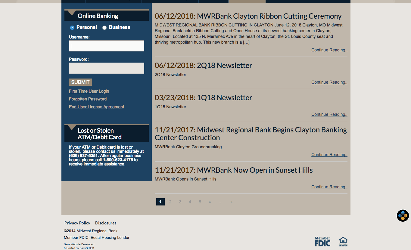
In other words, hubs that look like the image below don’t exactly scream “trustworthy” and “innovative.”

Finance brands tend to publish higher quality and more sophisticated content than other industries. But going from HBR or the Wall Street Journal to most finance brand blogs is like going from streaming Hulu to popping in a faded VCR tape you found under your dad’s couch.

Guess dad was really into Billy Banks workout videos in the ’80s
I’ve seen plenty of marketers baffled when readers don’t convert to customers. Sometimes it’s because the content isn’t very good. But more often, it’s because the site design makes it extremely difficult to convert in any way. People won’t sign up for your newsletter unless you prompt them to do so. They won’t check out products related to the topics you’re covering unless you make it easy.
One brand that does this extremely well is Marriott, with Marriott Traveler magazine. Traveler has over 40 editions around the globe, all run by Marc Graser, a former staffer at Variety and Entertainment Weekly, who refuses to publish any stories that feel like hotel ads. Instead, Traveler operates with the integrity of a high-quality travel magazine, publishing fun stories about little-known travel gems.
(Disclosure: Marriott is a Contently client. But read Traveler. It’s good.)
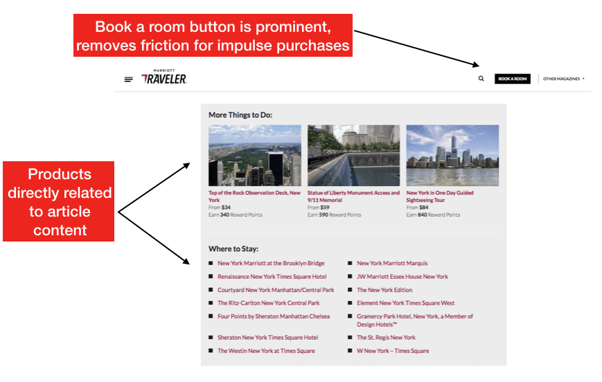
Even though Marriott Traveler doesn’t push product, it drives millions of dollars in direct revenue for the hotel giant. How? The site does a really good job of recommending related products and experiences to the story that you’re reading.
Take this article from Marriott about lesser-known, kind of weird things to do in Midtown Manhattan. It’s a smart addition to Traveler because it solves a common problem for tourists in New York City: Most of the hotels are in midtown, which gets boring after you’ve done the standard tourist activities. Everything seems like one giant M&M megastore—an artificial tourist trap designed to steal your money and give you diabetes. Most people figure that if you want to find anything classically “New York,” you need to head to the Village, Harlem, or the outer boroughs. This piece, however, details old-school New York attractions that fell under the radar, like a Houdini museum. Hell, I’ve lived in Manhattan for a decade and have never heard of that.
The article doesn’t plug Marriott at all, but it makes you think that maybe staying in midtown—where Marriott happens to have several hotels—isn’t so bad after all. And once you finish reading, Traveler makes it very easy to book a room or a Marriott Rewards experience with a module at the bottom of the page. Marriott essentially acts as the advertiser of its own high-quality editorial content.

And it works! Marriott Traveler would drive a fraction of the revenue for the company if the site didn’t make it so easy to book a hotel. Without that hard ROI, there’s little chance Marriott would have invested so heavily in Traveler, launching new editions around the globe every few months. Since the ad exists in a place where consumers are used to seeing advertising, it doesn’t corrupt the editorial experience. Everyone wins.
How do you create content that drives customer engagement while delivering ROI for the business?
-KL, London
This overlaps with what I wrote above about Marriott Traveler, but I’ll repeat it here with a twist of different analysis. Also, I may be a little conceited, but I’m not conceited enough to assume that you read everything that I wrote. (But if you do, thank you, I love you, and please scroll down to the next question.)
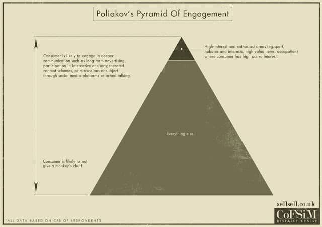
Marriott executes a strategy that I wrote about a couple of weeks ago on this blog. The best brand blogs follow the law of Poliakov’s Pyramid, which illustrates the narrow band of content that people actually want from brands—stories related to their interests and passions, and content that helps them do their job better.

In short, B2C brands should ask, “How can I help people live their lives better?”
B2B brands should ask, “How can I help people do their jobs better?”
Both groups should slap themselves with a fish if the primary answer to that question is just “our product!”
If adhere to Poliakov’s Pyramid—and if your answers are different than what’s already readily available on the web—you have a damn good chance to succeed. If you don’t, you’ll come across as the brand equivalent of the boring, self-absorbed jock villain in every ’80s teen movie.
Which tactics can be used to figure out the questions your target group is asking about a specific (read: technical) topic?
-Griselda, Stockholm
Let’s finish with a bulleted list, shall we? I promise there’s a kicker in here somewhere.
- Search data: It’s the holy grail of user questions. I love this simple overview by Moz on how to integrate search queries into your creative process.
- Internal search: What are people looking for on your site?
- Reddit/forum data: BuzzSumo recently integrated a lot of this really useful information.
- Persona interviews: Actually talking to the people you’re trying to reach might seem old school, but it’s super valuable.
- Surveys: We survey newsletter subscribers all the time to learn about their challenges and needs, which drives a lot of our story ideas.
- Help desk, accounts, sales, and other client-facing teams. These groups are a source of anecdotal data that can complement quantifiable research.
- Customer councils: Get your top prospects and clients in a room together and listen to what they’re struggling with. It’s a worthwhile way to get a bounty of valuable data. Facebook does this very well with its major agency and brand clients. In a few years, this will be mandatory when Mark Zuckerberg is named Dark Lord of the Connected Realm.
Joe Lazauskas is Contently’s head of content strategy and co-author of The Storytelling Edge. Ask him your most pressing content strategy questions here, or email him at lazer@contently.com.
Get better at your job right now.
Read our monthly newsletter to master content marketing. It’s made for marketers, creators, and everyone in between.


