Content Marketing
5 Simple Steps to Better Blog Typography
Hearkening  back to the renaissance, design has illuminated type, defining the structure of printed word and evolving into the typographical standards of now. The factors of type that are critical for print are just as critical for the web. Typography shapes your reader’s experience and communicates subtleties your words may not.
Most designers view web fonts as a delightful playground of decorative elements, and assume they will be reflected perfectly when the project is done and unleashed upon the world. After all, they painstakingly design a website and ensure it has adequate styling for all browsers, so why worry about the type? Far from friendly and controllable, web typography is an uncharted territory wherein designers have little influence.
Type has never before been used in such a variety of contexts and mediums. Font creators have to consider screen size, format and rendering engines. This new level of complexity makes it nearly impossible to create a perfect font that will look elegant and perform well under every scenario. Web designers and bloggers must contemplate user needs, behaviors and the voice of the content itself.
Here are five ways to put this understanding to use for better typography on your blog:
1. Leave the Personality to the Design
Choosing fonts that jive with the design of a blog is the first step most designers take, but conveying attitude and style should be left to the design elements. Rather than imposing design onto the blog’s content, or using a font the client thinks is cool, simplify the process by choosing a general font style such as serif over sans-serif, and leave the actual typeface decision up to technical factors.
2. Size Matters
A purely visual approach to choosing a font size can also backfire. A well-intended 14 pixels may be readable on a desktop browser in a specific resolution as long as the user isn’t zoomed in, or has text sizes set at the browser or operating system level. Typekit‘s Tim Brown suggests using the golden mean, or any meaningful scale, to determine the right scale for your design’s type. Once that perfect number is determined, you are able to build your stylesheets using ems, ensuring both a beautiful heading hierarchy and elegant scaling to all resolutions.
3. Function Over Form

As tempting as it may be to use a modern-looking font like Tulpen One, its narrow and thin form makes it unreadable at small sizes – which can spell disaster for mobile screens and browsers that anti-alias the font’s thin lines into non-existence. Prototype your typeface selections using tools like Typekit’s Font Browser or Webfont Specimen and choose fonts for their sharpness, clarity and browser compatibility.
4. Compatibility and Accessibility Vary

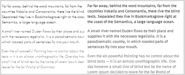
Trajan Sans as rendered by IE8 (top) and Chrome 4 (bottom)
The viewer’s operating system and browser impact a font’s clarity, as does the original intent of the font’s design. A user’s ability to read your text also comes into play, and is the most obvious motivator for perfecting your blog typography.
CSS affords us some small relief from the issues various formats introduce. By the time a suitable typeface is chosen and implemented, styles can help us build structure, provide emphasis and enhance a blog’s personality through color. By providing enough contrast, line spacing and hierarchy, you ensure readers are able to form the best relationship with your content.
5. Consider Performance

When deviating from default fonts, including Arial, Verdana and Georgia, any typeface you choose has to be served up by some other means. The type of font file and its method of implementation are yet other factors in how the font will perform under certain circumstances. Weigh the pros and cons of @font-face against hosted solutions like Typekit or Google Web Fonts, and include fallbacks in your stylesheets to a browser-default font.
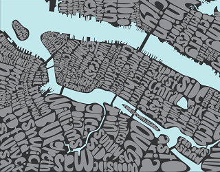
Typography Map image courtesy of Ursula Hitz
Get better at your job right now.
Read our monthly newsletter to master content marketing. It’s made for marketers, creators, and everyone in between.


